Scoring genre clarity...
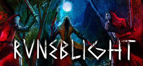
Runeblight is a retro, souls-like FPS set in a dying kingdom. As an eternal curse eats away at those who remain, an unlikely gift allows you to break the shackles of fate. Find secrets and hidden paths as you explore an interconnected world, tearing through cultists and monsters along the way.
$6.99Positive(12)
Early AccessBoomer ShooterFPS
Zero Percent JuiceFeb 13, 2026