Scoring genre clarity...
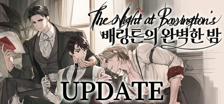
The Night at Barrington's is a BL mystery visual novel set in Victorian England. When servant Ethan is named the unexpected heir, he becomes entangled with the noble Barrington family's two sons—and uncovers the secrets hidden within the estate.
$29.99Mostly Positive(13)
SimulationVisual NovelLGBTQ+
Team JejungsinJan 8, 2026