Scoring genre clarity...
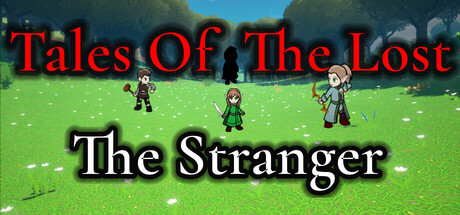
Tales Of The Lost: The Stranger capsule

Tales Of The Lost: The Stranger

The last of the elves are being hunted, and no one knows why. Journey through a world filled with ghosts, secrets, and forgotten truths in this story-driven RPG. Build your deck, control timing-based attacks, and unravel a mystery where every answer leads to another question.

Free to Play
Card BattlerVisual NovelCard Game
RJ 102 ProductionsTo be announced

Tales Of The Lost: The Stranger scores 68/100 — better than 19% of Card Battler capsules (n=690).

Free to Play · Released To be announced · By RJ 102 Productions

Quick text summary

Tales Of The Lost: The Stranger scored 68/100 on Steam Analyzer — Solid for a Card Battler capsule. Top priority fix: [genre_clarity] Add visual storytelling about the 'hunted' premise—such as a threatening silhouette in background, ominous shadow, or dynamic action pose—to communicate narrative uniqueness beyond generic party setup.

Capsule scores by dimension

  • Genre Clarity: 7/10 — Clear RPG adventure setting. The pixel art style, three character silhouettes in fantasy attire (archer, warrior, mage-like figures), and vibrant green field immediately signal a 2D RPG adventure game. At tiny size, the character lineup and fantasy aesthetic remain readable, though individual class identity becomes less distinct. The bright pastoral setting with character grouping reads as party-based combat RPG without ambiguity.
  • Title Readability: 7/10 — Title legible with minor hierarchy issues. Red title 'Tales Of The Lost' is clearly readable at full and small sizes with good contrast against the sky background, though the thin serif letterforms show slight degradation at tiny size. The white subtitle 'The Stranger' maintains adequate contrast and spacing. At tiny size both elements remain identifiable but the red title becomes slightly fuzzy due to thin stroke weight and lack of outline reinforcement.
  • Contrast & Color: 8/10 — Strong vibrant separation from Steam dark background. The bright lime-green field, blue sky gradient, and character sprites create excellent value separation against Steam's dark #1b2838 background, making the entire composition pop during quick scroll. The red title text provides additional warm-cool contrast that enhances visibility. Even in grayscale the composition maintains clear separation through bright greens and mid-blue tones against dark, creating a readable silhouette at all sizes.
  • Uniqueness & Polish: 6/10 — Competent pixel art with generic scene composition. The pixel art rendering is clean and well-executed, but the three-character lineup on a simple field is a common RPG capsule template without distinctive visual storytelling or mechanic communication. The scene shows capability but lacks a unique hook—no visual cue about the 'hunted' premise, story urgency, or what makes this adventure stand apart from other free-to-play RPGs. The execution is solid but the concept feels familiar within the genre.
  • Brand Consistency: 6/10 — Functional but not immediately iconic. The pixel art style is consistent with the game's likely visual identity, and the character designs appear cohesive in rendering and proportion. However, there are no distinctive brand markers—no unique color palette signature, no recognizable character silhouette, and no visual motif that would be memorable across multiple touchpoints. The green field and characters are pleasant but lack the iconic identity hooks seen in top-tier RPG branding.
  • Composition: 7/10 — Balanced layout with clear primary subjects. The three character sprites create a natural focal point in the center-lower portion of the composition, with the landscape framing them effectively. The title placement in the upper portion is safe from crop zones and maintains hierarchy. The composition reads clearly at small and tiny sizes with no element competing for attention. Minor issue: the wide horizontal spacing between characters and generous empty sky above could be tightened for more dynamic energy at thumbnail sizes.

What works

  • Bright, vibrant color palette. Lime green, blue sky, and character colors create excellent pop against Steam dark background and remain visually distinct even at tiny thumbnail size.
  • Clear character group focal point. Three well-spaced character sprites form an intuitive central focus that immediately communicates party-based gameplay without confusion.
  • Legible title hierarchy. Red and white title elements are readable at all sizes with good contrast and logical spacing, ensuring the game name is never lost in shrinking conditions.

What hurts the capsule

  • Generic RPG scene composition. Three characters on a field is an extremely common template that doesn't communicate the unique 'hunted' story premise or narrative urgency of the game.
  • Minimal brand identity differentiation. No distinctive color signature, iconic character pose, or memorable visual motif that would make this capsule recognizable as specifically Tales Of The Lost among other pixel-art RPGs.
  • Thin red title stroke at tiny sizes. The serif letterforms in 'Tales Of The Lost' lose some clarity at thumbnail size due to lack of outline reinforcement or weight adjustment for small scale visibility.

Priority fixes

  1. [genre_clarity] Add visual storytelling about the 'hunted' premise—such as a threatening silhouette in background, ominous shadow, or dynamic action pose—to communicate narrative uniqueness beyond generic party setup.
  2. [title_readability] Add a thin dark outline or slight glow to the red title text to maintain stroke integrity at tiny sizes and improve readability during quick scrolls.
  3. [uniqueness_polish] Introduce a distinctive visual element—a signature color accent, unique environmental detail, or iconic character attribute—that creates memorable brand recognition specific to this game.

Store copy priority fixes

  1. [hook_strength] Rewrite the short description to open with a specific action or conflict rather than 'hunted by a mysterious figure'—e.g., 'Command the last free elves in turn-based card battles against an unstoppable enemy' to immediately convey gameplay and stakes.
  2. [feature_communication] In the detailed description, add 1–2 sentences explicitly linking cards to combat—e.g., 'Build decks of elf abilities and summon creatures to counter monsters and human threats' to clarify the card battler loop.
  3. [uniqueness] Add a differentiator in the Key Information or opening paragraph that explains what sets this game apart—e.g., 'Play through interconnected stories of three elf survivors, each with unique card decks and personal stakes' or similar concrete claim.
  4. [tone_match] Revise the 'Key Information' bullets to match the atmospheric, story-focused tone of the opening rather than using generic boilerplate language, so the entire page feels cohesive.

Related guides

Steam app ID: 3718470 · Tags: Card Battler, Visual Novel, Card Game, Female Protagonist, RPG