Scoring genre clarity...
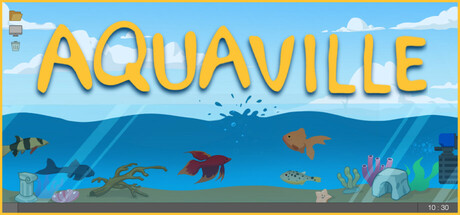
An idle desktop aquarium game where you buy, feed, and breed fish to discover new species with unique rarities and tiers. Decorate cozy tanks and customize your desk with cute items. Earn money just by caring for your fish, even while you work or relax!
$4.99Positive(14)
CasualSimulationFarming Sim
Team MachiavelliApr 27, 2026