Scoring genre clarity...

The Silent Witness capsule

The Silent Witness

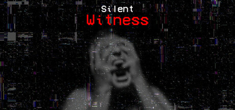
You’re a detective tracking a brutal murder. The forest holds the documents. The warehouse hides the body. Evidence in hand, you head back—but the forest has changed. The path is gone. Something’s watching. And it doesn’t want you to leave.

$2.992 user reviews
ExplorationCollectathonAction-Adventure
Abnormal StudiosJul 6, 2025

The Silent Witness scores 63/100 — better than 7% of Exploration capsules (n=4,872).

2 user reviews · $2.99 · Released Jul 6, 2025 · By Abnormal Studios

Quick text summary

The Silent Witness scored 63/100 on Steam Analyzer — Solid for a Exploration capsule. Top priority fix: [contrast_color] Reduce glitch noise density in the lower half and increase value separation between background and face to improve clarity at TINY size and grayscale contrast.

Capsule scores by dimension

  • Genre Clarity: 7/10 — Horror detective mystery established. The distorted grayscale face, glitch effects, and digital corruption strongly signal psychological horror and mystery. The visual language—distressed human subject, pixelated decay, surveillance-like quality—aligns with detective/thriller framing and reads at SMALL size. At TINY size the horror intent remains clear though the specific face detail becomes abstract noise.
  • Title Readability: 6/10 — Title legible but contrast uneven. "Silent Witness" appears in bright red text split across two lines at top center, which provides strong value contrast against the dark background. The red holds at SMALL and TINY sizes. However, the subtitle "Witness" in lighter weight competes visually with the larger "Silent" above, creating slight hierarchy confusion, and the thin letterforms risk softening at extreme reduction.
  • Contrast & Color: 7/10 — Strong red focal point, muddy shadows. The red title pops decisively against #1b2838 dark background with excellent value separation. The central grayscale face reads as a clear light-value element against darker surroundings. However, the glitch artifacts and digital noise in the lower half create muddy mid-tones that blur together in grayscale test, reducing overall silhouette clarity when squinting.
  • Uniqueness & Polish: 6/10 — Effective horror aesthetic, generic execution. The distressed face with digital corruption and glitch overlay effectively communicates supernatural/psychological horror and distinguishes from action-heavy genre peers. The choice feels thematic to detective-mystery horror. However, the treatment is a straightforward application of common horror capsule tropes (corrupted face, red text, digital noise) without a distinctive art hook or memorable visual signature that elevates it beyond competent baseline.
  • Brand Consistency: 5/10 — Thematic but lacks iconic identity. The distorted-face-with-glitch motif is internally cohesive and suits the game's description of supernatural dread and transformation. The grayscale grading and red accent create a recognizable palette. However, without reference to the 5 store screenshots, there are no distinctive brand markers—no character motif, symbolic icon, or signature art direction—that would make this capsule unmistakably recognizable as "The Silent Witness" versus other horror detective games.
  • Composition: 7/10 — Clear focal hierarchy, safe margins. The face occupies strong center-frame with title cleanly positioned at top, creating clear primary and secondary focus zones. Title sits within safe margins and won't be cropped by Steam's standard reductions. At SMALL size the composition holds with the face still reading as primary subject; at TINY size the face becomes abstract but red title remains the anchor point. No dead-space voids or edge-hugging clutter.

What works

  • Red title contrast. The bright red "Silent Witness" text creates immediate visual pop against the dark steam background and remains legible across all viewing sizes.
  • Horror intent clarity. Distorted face, glitch effects, and digital corruption immediately communicate psychological horror and mystery genre expectation at a glance.
  • Safe composition margins. Title and focal elements are positioned well within safe zones; no critical assets risk Steam's standard cropping across device sizes.

What hurts the capsule

  • Muddy lower half detail. Glitch artifacts and digital noise in the background create cluttered mid-tones that collapse into illegible mud under squint test and at TINY size.
  • Generic horror presentation. Corrupted face with red text and digital decay is a familiar horror capsule formula; the treatment lacks a distinctive visual hook or memorable art direction unique to this game.
  • No iconic brand marker. Without a character motif, symbolic prop, or signature art style, the capsule could represent many other horror games and offers no memorable visual identity for repeat recognition.

Priority fixes

  1. [contrast_color] Reduce glitch noise density in the lower half and increase value separation between background and face to improve clarity at TINY size and grayscale contrast.
  2. [uniqueness_polish] Introduce a distinctive visual element—such as a signature prop (e.g., evidence item), character silhouette trait, or art style accent—that signals this game's unique detective-mystery hook versus generic horror.
  3. [brand_consistency] Add a consistent iconographic symbol or subtle motif that can appear across store screenshots and community materials to build brand recognition.

Store copy priority fixes

  1. [feature_communication] Delete the Windows 11/10 microphone setup instructions entirely; replace with a single sentence explaining how the microphone mechanic affects gameplay progression (e.g., 'Stay silent or a creature will hunt you down').
  2. [feature_communication] Expand the 'How to Play' section to clarify the relationship between investigation, silence, and survival (e.g., how long do you have? Can you win by staying completely silent? What happens if you make noise?).
  3. [feature_communication] Fix the broken sentence 'Survive the horrors that layhead' and replace it with a concrete feature description.
  4. [audience_targeting] Add a line specifying approximate playtime and replay value (e.g., '2–4 hour experience' or 'multiple endings based on evidence collected') to help players assess fit.

Related guides

Steam app ID: 3720920 · Tags: Exploration, Collectathon, Action-Adventure, RPG, First-Person