Scoring genre clarity...
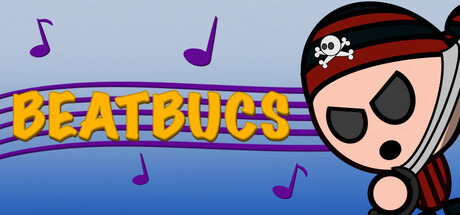
BeatBucs capsule

BeatBucs

Hop on a rhythm pirate adventure! Dodge enemies and face off against epic bosses, each moving to their own original track. From dancing crabs to Penguin DJs, navigate a dangerous pirate world. Can you survive the beat?

$4.99
ActionRhythmAction-Adventure
Bigote StudiosOct 28, 2025

BeatBucs scores 70/100 — better than 29% of Action capsules (n=8,534).

$4.99 · Released Oct 28, 2025 · By Bigote Studios

Quick text summary

BeatBucs scored 70/100 on Steam Analyzer — Good for a Action capsule. Top priority fix: [composition] Shift the pirate character slightly left and scale up to claim more visual weight in the center, ensuring safe margins and better focal hierarchy across all display sizes.

Capsule scores by dimension

  • Genre Clarity: 7/10 — Rhythm action with pirate theme clear. The pirate character with eye patch and skull bandana, combined with musical notes scattered across the composition, immediately signals a rhythm-action game with adventure elements. At tiny size, the music notes and pirate silhouette remain readable enough to suggest the genre, though the specific rhythm-gameplay hook could be stronger without additional context.
  • Title Readability: 8/10 — Bold yellow title legible at all sizes. BEATBUCS uses a large, bright yellow sans-serif font with a purple outline that contrasts strongly against the light blue background and reads clearly even at tiny thumbnail size. The title placement across the upper-middle section with controlled background ensures it doesn't fight with competing elements, though the outline could be slightly thicker for ultra-small displays.
  • Contrast & Color: 8/10 — Strong value separation with vibrant palette. The bright yellow title pops decisively against the light blue sky background, and the pirate character's warm peachy skin tone contrasts well with the darker hat and eye patch. The purple musical notes add accent color without muddying the composition, and at small size the silhouette remains readable with good edge definition.
  • Uniqueness & Polish: 6/10 — Competent cartoon style, somewhat generic execution. The art style is clean and appealing with a consistent cartoon aesthetic matching the whimsical pirate theme, but the overall composition feels like a standard indie game cover without a distinctive visual hook that communicates the core rhythm-dodge mechanic. The character design is charming but lacks the polish and memorable uniqueness seen in top-tier indie capsules like DAVE THE DIVER or Hades II.
  • Brand Consistency: 6/10 — Consistent cartoon style, limited identity signals. The art direction maintains internal cohesion with uniform cartoon rendering and a coherent warm-cool color palette, but there are no iconic symbols, signature motifs, or distinctive brand markers that would make BeatBucs instantly recognizable in a lineup. The pirate character is serviceable but not a standout mascot compared to memorable indie game protagonists.
  • Composition: 7/10 — Clear focal point with minor balance issues. The pirate character anchors the right side of the frame as the primary focal point, while the title dominates the left-center with musical notes providing visual rhythm across the composition. The layout works at full size but at tiny size the character edges close to the right margin, risking crop issues on some platform displays, and there's a slight imbalance with more visual weight on the right.

What works

  • High-contrast yellow title. The bright yellow BEATBUCS text with purple outline reads clearly at all sizes against the light blue background, ensuring immediate title recognition even at thumbnail scale.
  • Clear genre signals. Musical notes and pirate character work together to immediately communicate rhythm-action adventure, avoiding ambiguity about the core gameplay loop.
  • Cohesive art direction. The cartoon style is consistent throughout with a unified color palette and rendering approach that creates a polished, intentional look.

What hurts the capsule

  • Generic visual execution. While competent, the composition lacks distinctive visual storytelling or iconic elements that differentiate it from other indie adventure games in the browsing feed.
  • Character placement risk. The pirate character's right edge sits dangerously close to the margin, making it vulnerable to cropping on various Steam display contexts and reducing visual safety.
  • Limited brand identity. No memorable mascot, signature symbol, or unique visual motif that would make BeatBucs instantly recognizable on repeat exposure.

Priority fixes

  1. [composition] Shift the pirate character slightly left and scale up to claim more visual weight in the center, ensuring safe margins and better focal hierarchy across all display sizes.
  2. [uniqueness_polish] Integrate a distinctive visual element such as a unique boss character or signature rhythm-game UI cue (like beat markers or combo indicators) to communicate gameplay differentiation.
  3. [brand_consistency] Design or emphasize a recognizable mascot or icon that can carry the BeatBucs identity across future promotional materials and in-game contexts.

Store copy priority fixes

  1. [feature_communication] Add a sentence describing progression or escalation: e.g., 'Face 8+ uniquely choreographed bosses, each with escalating difficulty and rhythm complexity' to give players a sense of scope and replayability.
  2. [uniqueness] Emphasize what makes the rhythm patterns distinct from traditional rhythm games: e.g., 'Rhythm bosses don't follow preset tracks—learn and counter their attack patterns in real time' to highlight the dodge-based innovation.
  3. [feature_communication] Clarify the narrative payoff: e.g., 'Defeat each boss, reclaim your cat' to strengthen the rescue mission as a motivating thread rather than flavor text.

Related guides

Steam app ID: 3721290 · Tags: Action, Rhythm, Action-Adventure, 2D, Boss Rush