Scoring genre clarity...

Writer's Block capsule

Writer's Block

A Scrabble roguelike. Hire Scribes who bend the rules, rewrite tiles with Quills, outwit each chapter's Critic until a single word scores in the thousands. Get your book published or rejected... AGAIN!

Roguelike DeckbuilderWord GameCasual
w0o0oComing soon

Writer's Block scores 87/100 — better than 99% of Roguelike Deckbuilder capsules (n=424).

Released Coming soon · By w0o0o

Quick text summary

Writer's Block scored 87/100 on Steam Analyzer — Excellent for a Roguelike Deckbuilder capsule. Top priority fix: [uniqueness_polish] Add subtle visual hints of the roguelike progression (Scribes, Quills, Critic opponents) through secondary design elements or layering without cluttering the tile focus

Capsule scores by dimension

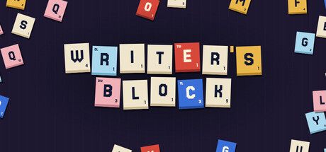
  • Genre Clarity: 8/10 — Word puzzle game identity clear. The Scrabble tile visual system immediately communicates a word-building game to viewers. Colored letter tiles scattered across the composition establish the word puzzle genre at full, small, and tiny sizes without ambiguity. At tiny size the clustered tile arrangement remains recognizable as letter-based gameplay.
  • Title Readability: 9/10 — Bold title dominates with clarity. WRITER'S BLOCK is rendered in large, high-contrast letter tiles using the actual game aesthetic as the presentation medium. The title uses a mix of colored and neutral tiles with strong saturation variation, maintaining legibility at small size and remaining readable even at tiny 120x45 pixels. This integrated design choice is both functionally clear and thematically on-brand.
  • Contrast & Color: 9/10 — Vibrant tiles pop against dark background. The dark navy #1b2838-adjacent background provides excellent contrast with the colorful letter tiles featuring reds, blues, yellows, pinks, and cream tones. Each tile maintains distinct value separation and saturation, creating strong silhouettes that survive the grayscale squint test and quick-scroll blur. The scattered tile arrangement ensures no key element blends into the background.
  • Uniqueness & Polish: 9/10 — Distinctive Scrabble aesthetic fully realized. The design commits entirely to the word-game theme by using actual Scrabble-style tiles as the primary visual and title treatment, communicating the unique roguelike-meets-word-puzzle hook instantly. The craft is clean with intentional color blocking and balanced tile placement that feels neither random nor template-based. This approach immediately distinguishes it from generic casual game capsules.
  • Brand Consistency: 9/10 — Strong iconic visual identity. The Scrabble tile aesthetic is recognizable and consistent with the core gameplay loop of hiring Scribes and manipulating word values. The color palette and tile-based composition create a memorable, signature look that aligns with the game's identity as a word-manipulation roguelike. This visual motif would be instantly recognizable in store listings or promotional materials.
  • Composition: 8/10 — Balanced hierarchy with clear focal point. WRITER'S BLOCK title occupies the center upper-third with strong hierarchy, while supporting scattered tiles above and below guide the eye without competing for attention. The composition maintains good breathing room and avoids edge-hugging dangers that could cause cropping issues on Steam. At tiny size the central title remains the primary focal point with supporting tiles providing visual context.

What works

  • Thematic title execution. Using letter tiles to spell the title perfectly reinforces the word puzzle genre and demonstrates the core mechanic immediately.
  • Excellent contrast and color pop. Vibrant Scrabble tile colors create strong visual separation against the dark background and read clearly at all viewing sizes.
  • Distinctive visual identity. The Scrabble aesthetic is immediately recognizable and differentiates the capsule from generic casual game presentations.
  • Strong readability at small sizes. The bold letter tile arrangement maintains clarity and genre communication even when scaled down to thumbnail dimensions.

What hurts the capsule

  • Limited visual storytelling beyond tiles. The capsule communicates the mechanic but doesn't hint at the roguelike progression, Critic challenges, or high-score objectives that differentiate the game.
  • Scattered layout could feel random. While intentional, the loose tile arrangement might read as casual rather than strategic, not fully communicating the tactical depth of the actual gameplay.

Priority fixes

  1. [uniqueness_polish] Add subtle visual hints of the roguelike progression (Scribes, Quills, Critic opponents) through secondary design elements or layering without cluttering the tile focus
  2. [composition] Consider a slight refinement to tile placement to create a stronger sense of intentional strategy or word-building momentum rather than pure scatter

Store copy priority fixes

  1. [hook_strength] Rewrite the short description opening to lead with a verb and benefit: 'Spell words from letter tiles and outwit critic opponents to score thousands of ink points—but fail and get rejected... AGAIN' replaces the comparison-first approach.
  2. [feature_communication] Add 1–2 sentences explaining Scribes: 'Scribes are unique helpers you draft between pages; each bends scoring rules differently, from rewarding vowels to multiplying your best words.' This fills the largest mechanical gap.
  3. [uniqueness] Add a sentence differentiating this from other roguelikes: 'Unlike typical deck roguelikes, every word you spell has real linguistic meaning—you can't just play random characters to game the system' or similar mechanical anchor.
  4. [audience_targeting] Add explicit audience signal: 'Ideal for word game lovers seeking strategy depth and roguelike replayability without time pressure' to move implicit signals into clear territory.

Related guides

Steam app ID: 3724030 · Tags: Roguelike Deckbuilder, Word Game, Casual, Board Game, Tabletop