Scoring genre clarity...
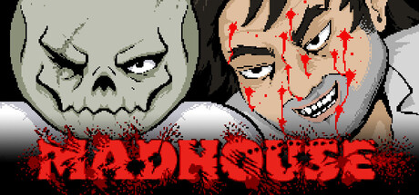
MADHOUSE is a horror action RPG where chibi characters slash and blast enemies in blood-soaked combat. Explore a dreary open world in the story campaign, or fight friends in the chaotic local 4-player versus mode. With retro pixel art and punk horror grit, it delivers macabre, thrilling action.
$4.999 user reviews
Early AccessHorrorRetro
Paul HubansOct 1, 2025