Scoring genre clarity...
Stackmon capsule

Stackmon

Stack, train and collect 100+ powerful Stackmon in this creature-collector with a card-stacking twist! Build your camp, challenge rival Scouts in combat and face the mysterious corruption spreading throughout your land.

StrategyCreature CollectorAdventure
Riftpoint EntertainmentQ3 2026

Stackmon scores 78/100 — better than 85% of Strategy capsules (n=5,305).

Released Q3 2026 · By Riftpoint Entertainment

Quick text summary

Stackmon scored 78/100 on Steam Analyzer — Good for a Strategy capsule. Top priority fix: [genre_clarity] Add a subtle visual stacking element—such as creatures stacked vertically or cards overlapping in the creature cluster—to communicate the signature stacking mechanic at a glance and differentiate from standard collectors.

Capsule scores by dimension

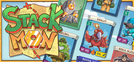
  • Genre Clarity: 8/10 — Clear creature-collector with stacking mechanic. The capsule immediately communicates a creature-collector game through visible Stackmon characters with distinct designs and colors (pink, blue, red variants), camp-building environment, and playful cartoon art style. At tiny size, the colorful creature cluster and camp setting remain recognizable as a creature-collection game, though the specific stacking mechanic is harder to discern without seeing the title.
  • Title Readability: 9/10 — Bold, legible, well-positioned title. STACK and MON are rendered in large, bright yellow-gold letters with orange/gold outlines and green accents, positioned in the upper-left quadrant against a controlled sky background. The title remains fully readable at small and tiny sizes due to strong letter forms, high contrast against the sky, and strategic placement away from cluttered elements.
  • Contrast & Color: 8/10 — Strong value separation and vibrant palette. The capsule uses a bright, saturated color palette with cyan sky, golden-yellow title, vibrant creature colors (pink, blue, red, green), and earthy camp elements that all separate clearly against each other. In grayscale, the bright sky and creatures maintain distinct edges and silhouettes; at tiny size, the value contrasts remain strong enough to read individual creature shapes.
  • Uniqueness & Polish: 7/10 — Polished, charming with clear creature-collector identity. The artwork demonstrates solid craft with clean line work, intentional character design, appealing color palette, and a cohesive cartoon aesthetic that feels premium and intentional. The stacking concept isn't visually emphasized on the capsule itself—it relies on title recognition rather than showing the mechanic—which slightly limits the unique selling point communication at a glance compared to genre leaders.
  • Brand Consistency: 7/10 — Recognizable character designs and cohesive style. The Stackmon creatures feature distinct, memorable silhouettes and a consistent cartoon art direction with warm-toned outlines and vibrant fill colors that feel proprietary to the brand. The art style is internally consistent and would likely remain recognizable across store screenshots, though there are no obvious signature motifs or iconic symbols that elevate memorability.
  • Composition: 8/10 — Well-balanced focal point with clear hierarchy. The title anchors the upper-left, the creature cluster forms a strong focal point in the center-right, and the camp environment provides supporting context in the lower third, creating good depth layering and visual flow. All primary elements remain within safe margins and the composition reads clearly at small and tiny sizes; no critical elements are cropped or lost at edge reduction.

What works

  • Legible title with strong contrast. STACK MON is rendered in large bold letters with yellow-gold fill and dark outlines, maintaining perfect readability from full size down to tiny thumbnails.
  • Distinctive character designs. The Stackmon creatures show clear individuality with varied colors, shapes, and poses that communicate a diverse roster and collector appeal immediately.
  • Clean, polished art style. The cartoon aesthetic is well-executed with consistent line work, intentional color choices, and professional rendering that feels premium and appealing.
  • Balanced composition across sizes. Title, creatures, and environment are strategically positioned to maintain clear hierarchy and focal points from full to tiny viewing sizes without collision or clutter.

What hurts the capsule

  • Stacking mechanic not visually explained. The unique card-stacking twist is communicated only through the title text; the creatures appear in a static camp scene without any visual indication of the stacking mechanic that differentiates it from standard creature-collectors.
  • Generic creature-collector presentation. While well-executed, the camp-and-creatures layout follows familiar collector-game conventions without a distinctive visual hook that immediately communicates the game's unique identity or core mechanic.

Priority fixes

  1. [genre_clarity] Add a subtle visual stacking element—such as creatures stacked vertically or cards overlapping in the creature cluster—to communicate the signature stacking mechanic at a glance and differentiate from standard collectors.
  2. [uniqueness_polish] Introduce an iconic visual motif or signature design element (card stack symbol, unique UI element, or creature arrangement) that becomes the game's recognizable brand cue across all marketing materials.

Store copy priority fixes

  1. [feature_communication] Consolidate the collection and evolution messaging into one paragraph to eliminate redundancy and make room for deeper explanation of the stacking mechanic's strategic depth.
  2. [uniqueness] Add one sentence comparing or contrasting Stackmon's stacking system to traditional creature collectors (e.g., 'Unlike standard card games, stacking lets you combine effects on the fly for infinite combinations').
  3. [audience_targeting] Include a clarity statement about pacing/difficulty, such as 'relaxing auto-battler' or 'strategy-focused' and whether progression is grindy or natural, to help the right players self-identify.
  4. [tone_match] Replace generic power-fantasy language ('show the strength,' 'prove your strength') with more playful, character-driven alternatives that match the cute visual tag and family-friendly category.

Related guides

  • Steam page optimisationCapsule, copy, screenshots, tags — the full Steam page conversion stack.
  • Steam tags guideTag selection, ordering, and how it shapes Steam's recommendation rails.

Steam app ID: 3729550 · Tags: Strategy, Creature Collector, Adventure, Card Game, Exploration