Scoring genre clarity...

Injection No.9 - Chapter 1 (The Prologue) capsule

Injection No.9 - Chapter 1 (The Prologue)

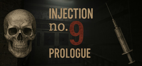
Injection No.9 - Prologue is the first standalone episode of a psychological horror series. Investigate a decaying asylum after an anonymous tip, with only brief messages guiding you as reality breaks apart.

$4.997 user reviews
AdventureActionSimulation
Ragdoll GamesJun 1, 2025

Injection No.9 - Chapter 1 (The Prologue) scores 73/100 — better than 61% of Adventure capsules (n=7,922).

7 user reviews · $4.99 · Released Jun 1, 2025 · By Ragdoll Games

Quick text summary

Injection No.9 - Chapter 1 (The Prologue) scored 73/100 on Steam Analyzer — Good for a Adventure capsule. Top priority fix: [contrast_color] Add subtle atmospheric fog or film grain around skull edges to increase depth perception and enhance the psychological horror mood without losing clarity at tiny size

Capsule scores by dimension

  • Genre Clarity: 8/10 — Strong horror and psychological thriller cues. The skull, syringe, and dark asylum aesthetic immediately communicate psychological horror and medical dread. At tiny size, the skull silhouette remains recognizable and the syringe is a clear danger/medical indicator. The overall composition signals investigative horror rather than action-adventure, though the genre context suggests this is accurate positioning for the prologue chapter.
  • Title Readability: 7/10 — Clear hierarchy with legible main title. The tan-gold 'INJECTION' and 'PROLOGUE' text contrasts well against the dark background and remains readable at small size. The red '9' provides a focal point accent. At tiny size, the text is still distinguishable though some serif detail is lost, and the tagline 'no.' is readable but minor.
  • Contrast & Color: 8/10 — Excellent value separation and silhouette clarity. The pale skull pops strongly against the dark background, and the tan-gold typography creates clear contrast with both the skull and background. The metallic syringe has bright highlights that read at all sizes. In grayscale, the light skull and text against dark background maintains strong separation, ensuring visibility even at tiny size.
  • Uniqueness & Polish: 7/10 — Distinctive horror identity with premium execution. The skull-and-syringe combination is a strong visual hook specific to medical horror rather than generic supernatural horror. The typography choices—tan serif lettering with red accent—feel intentional and cohesive. The design avoids common clichés by focusing on medical dread rather than ghostly or demonic imagery, though the presentation is straightforward rather than revelatory.
  • Brand Consistency: 7/10 — Coherent visual identity with recognizable motifs. The skull, syringe, and medical color palette (flesh tones, clinical steel, dark sterile background) form a consistent internal visual language. The tan-gold typography and red accent likely appear across marketing materials based on the prologue framing. This creates a distinctive brand anchor that could be recognized in future chapters, though it relies more on thematic consistency than an iconic unique character or symbol.
  • Composition: 7/10 — Strong focal hierarchy with balanced elements. The skull is positioned left-center as the primary focal point, with the title anchored in the upper-right quadrant, and the syringe on the right edge as a supporting element. This creates a natural left-to-right read. At small and tiny sizes, the skull remains the clear anchor while text stays centered and readable. The composition avoids clutter and maintains safe margins, though the syringe touches the right edge slightly.

What works

  • Skull silhouette is iconic and memorable. The weathered skull maintains clear recognition at tiny size and immediately communicates death, danger, and horror without ambiguity.
  • Color contrast pops against dark background. The pale skull and tan-gold text create strong value separation that ensures visibility in dark browsing conditions and quick scrolls.
  • Medical horror theme is distinct and clear. The syringe paired with skull is a specific visual hook that differentiates this from generic supernatural horror and signals the core premise.
  • Typography is intentional and readable. The serif tan lettering with red accent '9' guides the eye and maintains legibility across all viewing sizes.

What hurts the capsule

  • Syringe detail may blur at tiny size. The thin needle and small syringe proportions risk becoming unclear at thumbnail scale, reducing impact of the medical dread signifier.
  • Minimal unique visual storytelling. While the imagery is appropriate, it communicates theme and setting but not a unique core mechanic or selling point that distinguishes the prologue from other asylum horror games.
  • Right edge crowding with syringe placement. The syringe positioned near the right edge risks cropping or cutoff on certain Steam layouts, and the composition could feel slightly unbalanced.
  • Limited motion or atmospheric depth. The design is static with minimal layering, lacking the atmospheric haze or particle effects that could elevate premium polish relative to top-tier horror benchmarks like Hellblade II or Resident Evil 4.

Priority fixes

  1. [contrast_color] Add subtle atmospheric fog or film grain around skull edges to increase depth perception and enhance the psychological horror mood without losing clarity at tiny size
  2. [composition] Reposition syringe slightly inward from right edge to ensure safe margin and improve visual balance across all Steam layout scenarios
  3. [uniqueness_polish] Introduce a subtle animated element—such as a drip or slight glow on the syringe—or add cryptic text fragments to the dark background that hint at the asylum investigation theme and differentiate from static horror templates

Store copy priority fixes

  1. [hook_strength] Rewrite the short description to lead with the core tension: 'An anonymous tip drags you into a decaying asylum where reality unravels and a mysterious dispatcher knows too much—investigate before the building claims you.' This cuts the redundant title restatement and prioritizes intrigue.
  2. [uniqueness] Add 1-2 sentences explaining what makes the narrative or setting unique: e.g., 'Uncover the asylum's dark secrets through a web of corrupted evidence and an unreliable dispatcher' or identify a specific paranormal threat that sets tone apart from generic abandoned-building tropes.
  3. [audience_targeting] Clarify the core loop for your audience in the Gameplay section opening: e.g., 'Built for players who love slow-burn mystery and atmosphere over combat—explore, gather evidence, question reality, and survive your own mind.' This signals whether the game suits completionists, story-first players, or casual explorers.
  4. [feature_communication] Expand the Sanity System description to explain mechanical impact: e.g., 'Monitor your sanity through a wristwatch; as it drops, reality distorts—visual artifacts, audio cues, and doors shift—forcing you to question what is real.' This clarifies how the system shapes moment-to-moment tension.

Related guides

Steam app ID: 3731240 · Tags: Adventure, Action, Simulation, Interactive Fiction, First-Person