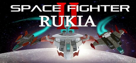
Spacefighter Rukia 2 scores 68/100 — better than 17% of Action capsules (n=8,534).

Quick text summary

Spacefighter Rukia 2 scored 68/100 on Steam Analyzer — Solid for a Action capsule. Top priority fix: [uniqueness_polish] Introduce a signature character, iconic ship design detail, or loot/progression visual element that uniquely identifies Rukia's looter-shooter gameplay and differentiates it from standard space shooters.

Capsule scores by dimension

  • Genre Clarity: 7/10 — Space shooter action clear. The three fighter ships centered on a lunar/planetary surface immediately communicate action-oriented spacefighter gameplay. The sci-fi military aesthetic with recognizable spacecraft silhouettes and the space setting strongly suggest a shoot'em up or space combat game. At tiny size, the ship arrangement and cosmic background still read as space combat, though the looter-shooter RPG progression layer is not visually apparent from this capsule alone.
  • Title Readability: 8/10 — Bold title clear at small sizes. SPACEFIGHTER RUKIA uses high-contrast white and red lettering with clear geometric sans-serif typeface positioned in the upper portion over a dark starfield. The title maintains strong legibility at small and tiny sizes due to high value contrast and substantial letter sizing. At tiny size, the red accent on FIGHTER remains visible and the two-line title structure holds coherence, though fine details of the logo mark become harder to distinguish.
  • Contrast & Color: 8/10 — Strong cyan and red pop. The capsule uses bright cyan energy effects around the ships and vivid red accent lights that stand out sharply against the dark space background and Steam's #1b2838 dark theme. The white ship hulls provide excellent silhouette separation from the space environment. In grayscale and tiny squint test, the ships maintain clear form and the red accents remain visually distinct, ensuring discoverability during quick scroll.
  • Uniqueness & Polish: 6/10 — Competent but familiar sci-fi. The capsule presents clean 3D spacecraft renders with professional lighting and a polished space environment, but the composition and visual approach closely resembles standard space action game marketing templates. The three-ship arrangement and lunar surface setting feel more functional than distinctive—there is no clear visual hook that communicates the unique looter-shooter RPG blend or differentiates it from dozens of similar indie space shooters.
  • Brand Consistency: 5/10 — Generic space aesthetic. The capsule establishes a consistent sci-fi military style with coherent rendering and color grading, but offers no memorable visual identity unique to Spacefighter Rukia itself. The cyan and red palette is functional but widely used across the genre; no character, symbol, or signature visual motif is present to create brand recognition for return visits or word-of-mouth identification.
  • Composition: 7/10 — Balanced focal point, clear depth. The three ships form a natural focal point centered horizontally with the title anchored above, creating good visual hierarchy and balance. The composition layers background stars, midground ships, and foreground lunar surface effectively to suggest depth. At small and tiny sizes, the arrangement remains coherent; however, the title placement slightly high and the empty space below the ships could be optimized for maximum impact at mobile/thumbnail dimensions.

What works

  • High-contrast title typography. White and red lettering with bold sans-serif fonts maintains excellent readability down to tiny capsule sizes without degradation.
  • Clean silhouette separation. The three spacecraft are rendered with clear edges and lighting that separates them distinctly from the space background even at small viewport sizes.
  • Professional 3D rendering quality. The spacecraft models, lighting, and cosmic environment are polished and convey production value appropriate for the price category.
  • Logical spatial composition. Three-ship arrangement with layered depth creates balanced, uncluttered visual hierarchy that guides the eye naturally.

What hurts the capsule

  • No distinctive brand identity. The capsule could belong to any mid-tier space shooter; there is no character, symbol, or signature visual element unique to Rukia.
  • Generic sci-fi aesthetic template. The composition, palette, and layout closely mirror established space action game templates without a memorable visual hook that communicates the looter-shooter RPG fusion.
  • Minimal gameplay mechanic visibility. The capsule shows ships but does not visually communicate the progression, loot, or customization systems that differentiate this title from standard shoot'em ups.
  • Title placement high and distant. The title sits far from the visual centerpiece, creating unused prime real estate below the ships that could enhance compositional balance.

Priority fixes

  1. [uniqueness_polish] Introduce a signature character, iconic ship design detail, or loot/progression visual element that uniquely identifies Rukia's looter-shooter gameplay and differentiates it from standard space shooters.
  2. [brand_consistency] Establish a distinctive color accent or visual motif (e.g., glowing runes, unique energy signature, character emblem) that becomes recognizable across store pages and marketing materials.
  3. [composition] Reposition the title lower or integrate it more directly with the ship centerpiece to eliminate dead space and improve compositional tightness for small/tiny viewport engagement.
  4. [genre_clarity] Add a subtle UI element, loot drop glow, or ship upgrade indicator to hint at the RPG progression layer and differentiate this from pure action shooters at a glance.

Store copy priority fixes

  1. [uniqueness] Explain what emerges from the shoot'em up + looter shooter blend—e.g., 'where skill-based dodge mechanics combine with build variety' or 'roguelike structure meets arcade intensity'—to justify why this mashup works.
  2. [hook_strength] Rewrite the short description opening to lead with an emotional hook or concrete moment: instead of 'A blend between,' try 'Master three pilot classes and customize their loadouts with hundreds of loot drops—then face escalating waves in endless New Game+' to make the player action feel immediate.
  3. [audience_targeting] Add a sentence clarifying difficulty expectation and time commitment: 'designed for solo players who love roguelikes' or 'from casual arcade fans to hardcore bullet-hell optimizers' so players self-select.
  4. [feature_communication] Expand on how Overclock and skill trees synergize with weapon loot: 'customize each pilot's skill tree to amplify your favorite looted weapons, then Overclock them for devastating combos' turns abstract mechanics into actionable gameplay.

Related guides

Steam app ID: 3732040 · Tags: Action, Arcade, Shooter, Bullet Hell, RPG