Scoring genre clarity...
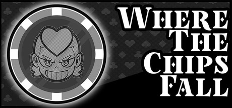
Where the Chips Fall capsule

Where the Chips Fall

Balatro Meets Blackjack with a Cuphead aesthetic in this casino rogue-lite where you gamble with your abilities. Every chip you bet can turn the tide in your favor, but you could also lose it all in a bad hand. Think you can beat the house? 

CartoonyCard GameCasual
Coquito Games2026

Where the Chips Fall scores 80/100 — better than 88% of Cartoony capsules (n=2,432).

Released 2026 · By Coquito Games

Quick text summary

Where the Chips Fall scored 80/100 on Steam Analyzer — Good for a Cartoony capsule. Top priority fix: [composition] Add a subtle card or chip stack element in the character's hand or background to reinforce the blackjack+chip gameplay hook at tiny size.

Capsule scores by dimension

  • Genre Clarity: 8/10 — Strong casino rogue-lite signaling. The circular chip/coin icon with a menacing character face immediately communicates a gambling game with personality. At tiny size, the iconic circular badge still reads as a game token or chip, and the aggressive expression suggests a competitive gambling mechanic. The Cuphead-inspired art style and monochromatic palette reinforce the indie casino strategy identity without ambiguity.
  • Title Readability: 8/10 — Bold serif title, clear at small sizes. All caps serif typography with strong white contrast against the dark background ensures readability at full and small sizes. The text spacing is deliberate and the letterforms remain distinct even when squinted. At tiny size, while individual letters compress, the chunky serif weight maintains enough visual weight to read as prominent game title.
  • Contrast & Color: 9/10 — Excellent value separation and clarity. The white title pops crisply against the near-black background, and the character icon is rendered in mid-gray with a bright white circular rim that creates strong silhouette separation. The grayscale stress test shows clean edges around the character and title with no muddy blending. At tiny size, the white rim of the badge becomes a memorable focal point that cuts through the darkness.
  • Uniqueness & Polish: 8/10 — Polished indie character design standout. The aggressive grinning face with distinct cartoon features and the clean circular badge framing feel intentionally crafted rather than generic. The Cuphead-inspired line work and expression convey both the gambling risk and the game's personality hook. The monochromatic treatment is a stylistic choice that sets it apart from colorful indie clutter, though execution is solid rather than groundbreaking.
  • Brand Consistency: 7/10 — Strong internal cohesion, iconic character. The menacing character in the badge is a memorable identity anchor that would be recognizable across marketing materials. The monochromatic circular design with white rim and serif typography create a cohesive, repeatable brand grammar. Without reference to the 5 store screenshots, internal consistency appears strong, though the single-character icon may lack variety for sustained brand presence across diverse layouts.
  • Composition: 8/10 — Well-balanced focal hierarchy, safe spacing. The circular character icon anchors the left-center, while the title stacks cleanly on the right with breathing room. The composition avoids edge-hugging and maintains safe margins that protect the design from Steam cropping. At small and tiny sizes, the left-weighted character remains the primary focal point while the title maintains secondary emphasis without competing for attention.

What works

  • Exceptional contrast against dark background. White title and rim create instantly recognizable silhouettes that survive tiny thumbnail sizes and quick scroll attention.
  • Distinctive character-driven identity. The grinning face in the chip badge is memorable and personality-forward, avoiding generic casino clichés.
  • Cohesive monochromatic art direction. The black-and-white palette feels intentional and premium rather than low-effort, reinforcing the indie polish.
  • Strong typographic hierarchy. Bold all-caps serif font is bold and legible at every size, with intentional spacing supporting readability.

What hurts the capsule

  • Limited color palette may feel austere. While striking, the monochromatic approach offers no visual richness or thematic color coding for game mechanics.
  • Title placement could risk edge cropping. The right-aligned title text sits relatively close to the right edge and may be partially clipped in certain Steam layouts or aspect ratios.
  • Character expression lacks gameplay context. The aggressive grin doesn't explicitly communicate the Balatro/blackjack hybrid mechanic; a chip stack or card visual might clarify faster.

Priority fixes

  1. [composition] Add a subtle card or chip stack element in the character's hand or background to reinforce the blackjack+chip gameplay hook at tiny size.
  2. [title_readability] Slightly reduce right margin of title or add a thin outline to ensure text survives edge cropping across all Steam viewport widths.
  3. [uniqueness_polish] Consider a secondary accent color (warm gold or red) in small doses to the rim or character to add visual richness without breaking the monochromatic strategy.

Store copy priority fixes

  1. [feature_communication] Expand the detailed description to explain the core progression loop: how many tables/acts exist, what makes each dealer unique, and how claimed abilities modify future hands or blackjack rules.
  2. [uniqueness] Replace generic positioning with a specific mechanical differentiator: e.g., 'Unlike traditional deckbuilders, your hand size is locked by blackjack rules—you must choose which chips to bet and which to hold' or a similar core design constraint.
  3. [feature_communication] Clarify the cheating system with one concrete example: 'Stack your deck by duplicating high-value chips' or 'Bribe dealers to reveal their hole card' to make it tangible rather than vague.

Related guides

Steam app ID: 3733250 · Tags: Cartoony, Card Game, Casual, Roguelike Deckbuilder, Hand-drawn