Scoring genre clarity...
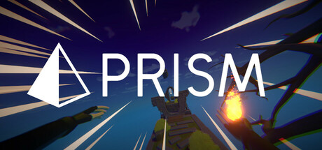
Master mystical spells and advanced movement techniques in PRISM, a first-person parkour speedrunning game where seconds count and style matters. Blast, slide, and swing your way through medieval landscapes to claim your place atop the leaderboards.
Free to PlayPositive(10)
ActionPlatformer3D Platformer
Mathieu Schmerber, Lucas DeutschmannMay 28, 2025