Scoring genre clarity...

Light Followers: Blinded by the Dark capsule

Light Followers: Blinded by the Dark

Dive deep in a deep dark realm filled with dangerous monsters, following the path where the light leads you to.

$2.991 user reviews
Action RoguelikeActionHack and Slash
dothouse0Jun 10, 2025

Light Followers: Blinded by the Dark scores 73/100 — better than 56% of Action Roguelike capsules (n=1,675).

1 user reviews · $2.99 · Released Jun 10, 2025 · By dothouse0

Quick text summary

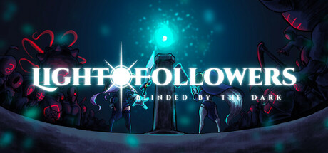
Light Followers: Blinded by the Dark scored 73/100 on Steam Analyzer — Good for a Action Roguelike capsule. Top priority fix: [title_readability] Reduce or simplify the tagline text size or remove it entirely to ensure only the main title competes for attention at tiny scale.

Capsule scores by dimension

  • Genre Clarity: 7/10 — Dark action adventure with clear cues. The glowing cyan light source, silhouetted figures in darkness, and supernatural red elements (floating objects, energy) immediately signal a dark fantasy or horror action game. At TINY size, the central light beacon and ominous atmosphere remain readable, though specific gameplay mechanics are not evident. The tagline 'BLINDED BY THE DARK' reinforces the thematic premise without explicit genre iconography.
  • Title Readability: 8/10 — Bold title with strong legibility. LIGHT FOLLOWERS uses a clean, uppercase sans-serif with bright white color and a subtle glow effect that stands out sharply against the dark background. At FULL size the title is crisp and well-positioned across the upper-middle area; at TINY size the letterforms remain distinct and readable. The tagline below is small and somewhat harder to parse at tiny scale, but the main title survives the reduction well.
  • Contrast & Color: 8/10 — Excellent value separation with vibrant accents. The bright cyan light source and white title text create strong value contrast against the dark teal and navy background, reading clearly even with a quick scroll and mental squint. Red floating elements add saturated accent color that draws the eye without muddying the palette. The silhouetted figures and foreground elements maintain clear edges in grayscale, ensuring the composition does not collapse into muddy mid-tones.
  • Uniqueness & Polish: 7/10 — Polished thematic execution, moderate originality. The light beacon as a central metaphor and the contrast of darkness with radiant energy feel intentional and thematically cohesive. The floating red symbols and particle effects suggest a premium production, though similar dark-fantasy light-vs-dark visuals are common in indie horror and action games. The craft is clean and the effect work is professional, but the core concept is not entirely fresh within the action-indie space.
  • Brand Consistency: 6/10 — Thematic consistency, limited iconic identity. The cyan-and-red color palette and central light beacon appear intentional and would likely carry across marketing materials. However, without reference to the store screenshots, no strong iconic character, motif, or signature logo is immediately recognizable as a franchise identity. The visual direction is cohesive but reads more as a polished one-off thematic choice rather than a distinctive brand mark.
  • Composition: 8/10 — Clear hierarchy with centered focal point. The cyan light source anchors the center, with the title positioned above it and silhouetted figures flanking the composition. This creates a strong vertical hierarchy that reads clearly at SMALL and TINY sizes. The arrangement uses depth effectively—background glow, midground figures, foreground title—and the margins are safe; no critical elements are cramped to edges or at risk of Steam cropping.

What works

  • High contrast title and light beacon. Bright white title and cyan glow stand out sharply against dark background, maintaining readability at all sizes including tiny thumbnails.
  • Thematic coherence with light-dark metaphor. The central radiant beacon and surrounding darkness reinforce the game's core premise and create a memorable visual hook.
  • Professional particle effects and depth layering. The red floating elements and glow work give the capsule a polished, premium feel with good spatial separation between foreground and background.
  • Strong centered composition. Clear focal hierarchy with the light beacon at center and silhouetted figures flanking it, preventing scattered attention or composition collapse at small sizes.

What hurts the capsule

  • Tagline legibility at tiny size. The secondary text 'BLINDED BY THE DARK' becomes difficult to parse at TINY size due to its smaller point and position on the noisy particle field.
  • Limited brand identity distinctiveness. While thematically strong, the visual does not establish a memorable iconic character, logo, or signature motif that would create lasting franchise recognition.
  • Modest originality within indie action space. The light-versus-dark thematic and glowing beacon concept, while executed well, echoes existing dark-fantasy and horror indie titles without a clear unique selling point.

Priority fixes

  1. [title_readability] Reduce or simplify the tagline text size or remove it entirely to ensure only the main title competes for attention at tiny scale.
  2. [brand_consistency] Introduce a distinctive icon, character silhouette, or symbol that can serve as a recognizable brand mark across future promotional materials.
  3. [uniqueness_polish] Consider adding a gameplay-specific visual cue (e.g., a unique enemy silhouette, light mechanic indicator, or artifact) to differentiate the core mechanic and strengthen the unique selling point.

Store copy priority fixes

  1. [hook_strength] Rewrite the short description to lead with the core mechanic: 'Survive procedurally-generated demon dungeons where your vision is limited to flickering light sources—manage your torch, hunt demons, and light your way forward to escape.' This immediately signals gameplay and differentiator.
  2. [uniqueness] Add a dedicated paragraph in the detailed description explaining how the light mechanic transforms combat and exploration: 'Your vision is restricted to lit areas, forcing tactical decisions about when to engage demons and which candles to light for safe passage.' Position this immediately after the opening story setup.
  3. [feature_communication] Restructure the detailed description with a clear hierarchy: (1) Story premise, (2) Core loop (hunt → level up → light candles → progress), (3) Mechanics breakdown, (4) Controls. Use numbered lists or bold headers to guide scanning.
  4. [tone_match] Unify the narrative voice: either develop the demon-hunter story throughout (more cinematic) or commit to a mechanics-first approach (more instructional), rather than jarring shifts between them.

Related guides

Steam app ID: 3737700 · Tags: Action Roguelike, Action, Hack and Slash, 2D, Top-Down