Planets Ambrosia scores 70/100 — better than 26% of Shoot 'Em Up capsules (n=814).

Quick text summary

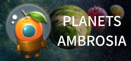
Planets Ambrosia scored 70/100 on Steam Analyzer — Good for a Shoot 'Em Up capsule. Top priority fix: [uniqueness_polish] Emphasize the fruit-machinery fusion more visibly in the creature design with stronger visual cues (e.g., clearer mechanical parts, fruit skin texture integration) to communicate the core quirk immediately at SMALL and TINY sizes.

Capsule scores by dimension

  • Genre Clarity: 7/10 — Sci-fi shooter with quirky twist. The orange fruit-machine hybrid creature in a space setting with a gun-like apparatus clearly signals a sci-fi shooter, though the cartoonish fruit fusion element is unusual for the genre. At TINY size, the spherical robot with glowing eye and the planetary background still read as space-themed action, though the exact fruit-fusion mechanic is less obvious without context. The genre implication is solid but the unique fruit-machinery fusion hook is subtle at small scales.
  • Title Readability: 8/10 — Clean white sans-serif text. PLANETS AMBROSIA uses bold white sans-serif lettering positioned in the right half of the composition against a darker starfield background, ensuring strong contrast and legibility at all sizes. The text remains readable at SMALL and TINY scales without decorative flair that would collapse. Spacing is clean and the lack of outline or shadow keeps it crisp, though at TINY size the two-line split may compress slightly.
  • Contrast & Color: 8/10 — Strong value separation and silhouette. The bright orange fruit-robot protagonist pops clearly against the deep starfield and dark space background, with the glowing blue eye creating additional luminous contrast. The white title text maintains excellent separation from the darker upper right planetary elements. At TINY size, the orange orb and white text both read distinctly without losing definition in grayscale, though some mid-tone planet detail softens slightly.
  • Uniqueness & Polish: 6/10 — Generic space shooter with mild quirk. The capsule presents a competent sci-fi aesthetic with stars and planets, but the execution feels fairly standard for indie space games. The fruit-machine hybrid creature is a unique selling point conceptually, but the visual treatment of that creature reads more like a generic cartoon orange robot with a leaf attachment rather than a memorable fruit-fusion design that communicates the core gameplay hook. The overall polish is clean but lacks distinctive visual storytelling that sets it apart from top-tier indie shooters.
  • Brand Consistency: 6/10 — Minimal visual identity markers. The orange protagonist and starfield setting are present, but without access to the store screenshots it is difficult to confirm a cohesive internal art direction or recognizable brand motif beyond the basic color scheme. The creature design feels somewhat isolated rather than part of a larger visual ecosystem, and there are no signature symbols, palette choices, or recurring elements that suggest strong brand identity. A second viewing would anchor consistency scoring, but currently it registers as serviceable without memorable iconography.
  • Composition: 7/10 — Clear focal point with balanced layout. The orange fruit-robot occupies the left-center foreground as the clear primary subject, while PLANETS AMBROSIA anchors the right-center midground, and the starfield with planets creates layered depth. The layout avoids clutter and maintains good visual hierarchy, with the robot and text sharing attention without competing. At SMALL and TINY sizes, both elements remain distinct, though the planet details in the upper right lose some definition and the overall composition compresses slightly but holds legibility.

What works

  • Excellent title contrast and legibility. White sans-serif text reads cleanly at all sizes against the dark starfield, with no outline clutter or decorative loss of clarity.
  • Strong value separation for subject. The bright orange protagonist and glowing blue eye create unmistakable silhouette separation from the deep space background in grayscale and color.
  • Uncluttered focal hierarchy. The robot and title share focus without scattered competing elements, maintaining clear read at TINY size through clean negative space.

What hurts the capsule

  • Weak visual communication of core hook. The fruit-machinery fusion mechanic that differentiates this game is subtle in the creature design and does not immediately signal the unique gameplay premise at a glance.
  • Generic space-shooter aesthetic. The starfield and planet backdrop feel standard for sci-fi indie games and do not establish a distinctive visual identity or memorable brand signature.
  • Mid-tone planet detail softens at scale. The celestial bodies in the background lose definition at TINY size, creating slight visual mudding in the upper right despite overall strong contrast.

Priority fixes

  1. [uniqueness_polish] Emphasize the fruit-machinery fusion more visibly in the creature design with stronger visual cues (e.g., clearer mechanical parts, fruit skin texture integration) to communicate the core quirk immediately at SMALL and TINY sizes.
  2. [brand_consistency] Establish a signature color accent or recurring visual motif beyond orange and white (e.g., a glowing plant element or tech-fruit hybrid symbol) that strengthens recognizable identity across marketing materials.
  3. [composition] Increase visual depth separation between the starfield and planets using clearer contrast or depth haze to prevent mid-tone blending at TINY scale.

Store copy priority fixes

  1. [hook_strength] Replace 'All-out 360-degree assault' with a sentence that leads with the fruit-machine enemy concept and the gameplay verb, e.g. 'Blast grotesque fruit-machine hybrids in a relentless 360-degree bullet hell' to hook players on the unique visual identity first.
  2. [feature_communication] Add 2-3 concrete weapon or upgrade examples in the detailed description, e.g. 'Upgrade rapid-fire cannons, spread shots, or charge attacks' to replace the vague 'strategic weapon choices' and give players a mental model of progression.
  3. [audience_targeting] Insert a sentence about accessibility or difficulty in the detailed description, e.g. 'Perfect for casual roguelite fans who want action without twitchy timing' or 'Hardcore bullet-hell veterans seeking a fresh visual twist', to clarify the intended player.
  4. [uniqueness] Expand on why the fruit-machine fusion matters beyond aesthetics, e.g. 'Each grotesque boss combines fruit powers with mechanical attacks, forcing you to adapt your loadout' to explain how the unique concept affects core gameplay strategy.

Related guides

Steam app ID: 3737960 · Tags: Shoot 'Em Up, Bullet Hell, Casual, Top-Down Shooter, Roguelite