Scoring genre clarity...

First Age capsule

First Age

A turn-based strategy card game set in the Neolithic Age. Sacrifice villagers, tame mammoths, and build powerful card synergies to lead your tribe through the threat of the Dark Ages. Will your people stand the test of time?

Card GameManagementTurn-Based Tactics
CopsolTo be announced

First Age scores 70/100 — better than 27% of Card Game capsules (n=1,065).

Released To be announced · By Copsol

Quick text summary

First Age scored 70/100 on Steam Analyzer — Good for a Card Game capsule. Top priority fix: [uniqueness_polish] Integrate a subtle card or deck visual element into the composition—such as illuminated cards in hands, glowing runes on stones, or a card-like UI frame around the focal fire area.

Capsule scores by dimension

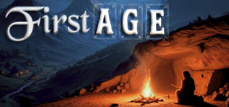
  • Genre Clarity: 7/10 — Tribal strategy setting clear. The Neolithic campfire scene with silhouetted figures and glowing fire establishes a primitive tribe narrative immediately. At TINY size, the warm orange glow and mountain silhouette still convey a survival or strategy game with historical/ancient setting, though the specific card game mechanic is not visually apparent. The cave dwelling and gathering pose suggest settlement building or resource management rather than combat-focused strategy.
  • Title Readability: 8/10 — Strong serif font, good contrast. The 'First AGE' title uses a clear serif font with white lettering that contrasts well against the blue-orange gradient background. The title remains readable at SMALL size due to generous spacing and weight; at TINY size it becomes slightly compressed but still legible due to the high contrast and serif structure. No subtitle clutter compromises the core message.
  • Contrast & Color: 8/10 — Warm fire glow pops clearly. The orange campfire and warm ground tones create strong value separation against the cool blue mountain sky background, reading well even when squinted. The silhouetted figures and cave entrance maintain clear edges and depth layering in grayscale contrast. At TINY size, the warm-cool split still registers distinctly and the focal fire area does not blend into the Steam dark background.
  • Uniqueness & Polish: 6/10 — Competent but generic tribal scene. The artwork is well-rendered with professional lighting and atmospheric perspective, but the campfire-and-cave scene is a familiar trope for prehistoric or tribal games and lacks a distinctive visual hook specific to card mechanics or the game's unique identity. The silhouettes are posed naturally but do not communicate the turn-based card game core mechanic or what separates this from other tribe-building sims. The execution is solid but the concept feels generic within the strategy-simulation category.
  • Brand Consistency: 6/10 — Cohesive art style, no icons. The capsule demonstrates consistent warm-cool color palette and realistic lighting throughout, with coherent painting style and atmospheric tone. However, there are no signature motifs, iconic symbols, or memorable brand identity cues that would make this recognizable as uniquely 'First Age' across multiple touchpoints. The look is professional but interchangeable with other historical strategy games without additional brand markers.
  • Composition: 7/10 — Clear focal hierarchy, safe margins. The glowing campfire forms a natural focal point in the lower-center area, with silhouetted figures arranged around it to guide the eye, creating a strong compositional triangle. The title sits in the upper region with clear separation from the action, avoiding edge clash and maintaining safe margins for Steam cropping. At SMALL and TINY sizes the fire remains the dominant visual anchor, though the finer details of individual figures dissolve into silhouette blur.

What works

  • Title contrast and legibility. White serif font reads clearly against the gradient background at both SMALL and TINY sizes without losing form or requiring outline enhancement.
  • Warm-cool color separation. Orange firelight against blue mountain sky creates strong value contrast that registers in grayscale and does not blend into the Steam dark background.
  • Atmospheric depth layering. Multiple planes—distant mountains, cave structure, foreground fire, and silhouetted figures—create visual depth and guide focus to the central campfire.

What hurts the capsule

  • Generic tribal aesthetic. The campfire-and-cave scene lacks distinctive visual cues that communicate this is a turn-based card game rather than a survival or settlement sim.
  • No card game iconography. The capsule shows no visual hint of the card mechanic, deck building, or synergies that define the core gameplay loop.
  • Interchangeable brand identity. No signature color palette, motif, or symbol distinguishes this from other Neolithic or tribal strategy games without additional context.

Priority fixes

  1. [uniqueness_polish] Integrate a subtle card or deck visual element into the composition—such as illuminated cards in hands, glowing runes on stones, or a card-like UI frame around the focal fire area.
  2. [genre_clarity] Add a visual cue specific to the card game mechanic, such as mammoth taming imagery or sacrifice ritual symbolism, to clarify the turn-based card synergy concept.
  3. [brand_consistency] Develop a signature icon or motif (e.g., a tribal symbol, card suit, or mammoth silhouette) that can appear consistently across store screenshots and marketing materials.

Store copy priority fixes

  1. [hook_strength] Rewrite the opening line to lead with a unique verb or emotional hook: e.g., 'Sacrifice your villagers and tame mammoths to forge card synergies that will carry your tribe through the Dark Ages' or 'Build impossible civilizations from a single settlement in this Neolithic deckbuilder where every card combo rewrites history.'
  2. [tone_match] Remove or rephrase the developer note at the end to maintain professional tone throughout, or integrate it more authentically into a 'About' section rather than undermining the game's credibility in the store copy.
  3. [feature_communication] Restructure the nine resource paths section with visual hierarchy (bold headers, sub-bullets, or explicit 'core vs. advanced' labeling) to help players quickly understand which strategies matter most on a 30-second skim.
  4. [audience_targeting] Add an explicit accessibility or difficulty statement in the detailed description (e.g., 'Fully adjustable difficulty lets you explore synergies at your own pace or compete for high scores against the leaderboard') to signal that both experienced and new players are welcome.

Related guides

Steam app ID: 3738120 · Tags: Card Game, Management, Turn-Based Tactics, Roguelite, Deckbuilding