À La Mine scores 72/100 — better than 41% of Turn-Based Tactics capsules (n=1,210).

Quick text summary

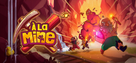
À La Mine scored 72/100 on Steam Analyzer — Good for a Turn-Based Tactics capsule. Top priority fix: [uniqueness_polish] Introduce a visual element that communicates the betrayal and shifting alliance mechanic—consider showing characters with opposing visual cues (e.g., one character with a crown vs. others turning against them) to hint at the social deduction core gameplay.

Capsule scores by dimension

  • Genre Clarity: 7/10 — Party game with strategy elements. The capsule suggests a colorful, chaotic multiplayer experience with cartoon characters in action poses against a fiery mine setting, which aligns with the party/strategy hybrid nature. At TINY size, the bright colors and character silhouettes read as 'fun multiplayer game' but the specific strategy betrayal mechanics are not visually apparent—the design leans more toward lighthearted party game than tactical depth.
  • Title Readability: 8/10 — Bold yellow logo, clear at all sizes. The 'À La Mine' title uses a thick yellow-gold logotype with red and black accents positioned in the upper left quadrant against a darker background, ensuring strong contrast and legibility. At TINY size the logo remains readable and distinctive; the pickaxe icon integrated into the design adds personality without compromising clarity.
  • Contrast & Color: 8/10 — Warm fire palette with strong separation. The design uses a bold warm gradient from deep burgundy to bright orange-yellow, creating strong value separation against the Steam dark background. Character silhouettes and the yellow title pop clearly; the grayscale silhouette test shows excellent edge definition and foreground-background separation that holds at TINY size.
  • Uniqueness & Polish: 7/10 — Polished cartoon art, generic premise framing. The capsule demonstrates clean character animation, cohesive art style, and intentional lighting effects that feel premium and well-crafted. However, the core visual composition—characters in a mine with explosion effects—reads as a fairly generic action-party setup without a clear unique selling point visible in the imagery; the narrative hook of betrayal and shifting alliances is not communicated through the design.
  • Brand Consistency: 6/10 — Consistent cartoon style, limited identity cues. The art direction is internally coherent with a consistent cartoon aesthetic, warm color palette, and character design approach across the visible elements. However, there are no strong iconic symbols, signature motifs, or memorable brand identity markers that would make this capsule instantly recognizable as 'À La Mine' versus a generic indie party game.
  • Composition: 7/10 — Clear focal point, balanced layout. The composition features a strong primary focal point with the characters and explosion in the center-right, balanced by the title in the upper left, creating natural eye flow. The depth layering (foreground characters, mid-ground effects, background glow) reads well at SMALL size; at TINY size the layout remains coherent though some character detail is lost, but overall hierarchy is maintained.

What works

  • Strong color contrast against dark Steam background. The warm orange-yellow gradient and bright character colors create immediate visual pop and distinguish the capsule in quick scrolling.
  • Readable and distinctive logo with integrated icon. The yellow 'À La Mine' title with pickaxe design maintains legibility at all sizes and has memorable visual personality.
  • Polished cartoon art style and animation. Clean character models, intentional lighting, and explosion effects convey premium indie craftsmanship.
  • Clear focal point and balanced composition. The eye naturally flows from title to center action without scattered attention or awkward dead space.

What hurts the capsule

  • Generic mine action premise without unique hook. The visual composition does not communicate the game's core mechanic of betrayal and shifting alliances; it reads as standard multiplayer chaos rather than strategic deception.
  • Limited brand identity and iconic imagery. No signature motif, character, or visual symbol distinguishes this capsule from other colorful indie party games in memory.
  • Lacks clear visual storytelling of core mechanic. The burning mine and cartoon action do not visually hint at the social deduction, alliance, and betrayal gameplay that defines the title.

Priority fixes

  1. [uniqueness_polish] Introduce a visual element that communicates the betrayal and shifting alliance mechanic—consider showing characters with opposing visual cues (e.g., one character with a crown vs. others turning against them) to hint at the social deduction core gameplay.
  2. [genre_clarity] Add a subtle UI element or visual cue that signals strategy and negotiation over pure action—such as a hand gesture, speech bubble, or visual representation of player conflict resolution.
  3. [brand_consistency] Develop a signature brand motif or icon (beyond the pickaxe) that could become instantly recognizable as 'À La Mine'—consider a unique character silhouette or symbolic alliance visual.

Store copy priority fixes

  1. [feature_communication] Condense the Friend Pass section into 2-3 sentences instead of bullet points; the restrictions are clear but over-formatted for a store page.
  2. [uniqueness] Strengthen the closing by replacing generic developer boilerplate with a specific example of how the asymmetrical two-phase design creates unique emergent stories (e.g., 'Watch underdog workers orchestrate a union comeback against dominant owners').
  3. [genre_clarity] Consider adding a single sentence early in the detailed description that compares the experience to a familiar reference (e.g., 'Like Diplomacy or Coup, but as a territory-control strategy game'), to help players unfamiliar with board games grasp the social-deduction angle.

Related guides

Steam app ID: 3739830 · Tags: Turn-Based Tactics, PvP, Tutorial, Board Game, Tabletop