Quick text summary
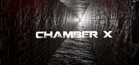
CHAMBER X scored 68/100 on Steam Analyzer — Solid for a Adventure capsule. Top priority fix: [uniqueness_polish] Introduce a distinctive visual element—iconic artifact, character silhouette, or unique visual mechanic—visible in the tunnel to differentiate from generic industrial puzzle games.
Capsule scores by dimension
- Genre Clarity: 7/10 — Horror puzzle escape room clear. The industrial brick corridor with vanishing point perspective and harsh lighting strongly signals puzzle/escape room gameplay. At TINY size, the geometric grid walls and claustrophobic tunnel composition read as confinement and mystery, though the horror element is subtle rather than visceral. Genre intent is readable but could be sharper—the setting feels more industrial mystery than overtly supernatural horror.
- Title Readability: 8/10 — Bold white title legible all sizes. CHAMBER X uses a clean, heavy sans-serif in stark white centered over the vanishing point. The title remains readable at SMALL and TINY sizes due to high contrast against the dark brick walls and strong letterform weight. Text placement directly on the focal point is strategic and doesn't compete with background clutter.
- Contrast & Color: 8/10 — Strong monochromatic dark-light separation. The capsule leverages a deep monochromatic palette with white title and distant light source creating clear silhouette separation. At SMALL and TINY sizes, the value contrast between the dark walls, mid-tone brick texture, and bright vanishing point light is distinct and readable in grayscale. The overall composition avoids muddy mid-tones and maintains clear edge definition.
- Uniqueness & Polish: 6/10 — Competent industrial aesthetic generic execution. The perspective tunnel is a recognizable visual language for escape rooms and puzzle games, but the execution feels like a stock 3D render rather than a distinctive art hook. The capsule is well-crafted technically but lacks a memorable character, symbol, or unique visual storytelling that separates it from other industrial horror games. Compared to peers like DREDGE or Chants of Sennaar, it reads more as functional than distinctive.
- Brand Consistency: 5/10 — Minimal identity signals generic industrial. The capsule establishes an industrial, constrained atmosphere but offers no iconic motif, character, or signature palette that would be recognizable across store materials. Without access to store screenshots for comparison, the monochromatic aesthetic and perspective tunnel could belong to any number of puzzle-horror titles. The brand identity is defined by setting alone rather than a memorable visual signature.
- Composition: 7/10 — Strong focal point vanishing perspective. The one-point perspective naturally draws the eye down the tunnel to the distant light, creating a clear primary focal point and visual hierarchy. At SMALL and TINY sizes, the composition reads as a cohesive silhouette with no scattered attention or clutter. Text placement is centered and balanced, though the composition relies heavily on a single dominant geometric device rather than layered depth.
What works
- Clear vanishing point focal hierarchy. The tunnel perspective creates an obvious primary focal point and visual direction that reads strongly at all sizes without competing elements.
- High contrast white title on dark. CHAMBER X maintains excellent legibility at TINY size with bold white letterforms positioned centrally over controlled background.
- Strong monochromatic value separation. The grayscale composition uses distinct light-dark separation that avoids muddy mid-tones and maintains silhouette clarity even when squinting.
What hurts the capsule
- Generic industrial puzzle aesthetic. The perspective tunnel is a familiar visual trope in escape-room and puzzle games, lacking a distinctive hook or memorable identity cue.
- No character or unique visual storytelling. The capsule communicates setting and mood but doesn't showcase a core mechanic, unique character, or visual signature that differentiates it from competitors.
- Limited depth layering and staging. The composition relies on a single geometric device (perspective) rather than purposeful background-midground-foreground staging with multiple focal points.
Priority fixes
- [uniqueness_polish] Introduce a distinctive visual element—iconic artifact, character silhouette, or unique visual mechanic—visible in the tunnel to differentiate from generic industrial puzzle games.
- [brand_consistency] Add a signature motif or color accent (subtle glow, symbolic object, or visual pattern) that could appear consistently across store materials and build brand recognition.
- [composition] Layer additional foreground detail or a contextual object in the immediate space to create depth and visual interest beyond the vanishing point alone.
Store copy priority fixes
- [hook_strength] Replace 'Unlock the mysteries of a haunted world' with a specific, action-forward hook like 'Solve twisted riddles before the chamber seals you in' to lead with the core tension immediately.
- [feature_communication] Replace the vague feature bullets with concrete, player-focused descriptions: e.g., 'Environmental puzzles that evolve as the walls physically close in' instead of 'Eerie environments that challenge your wits.'
- [uniqueness] Add one clear differentiator in the short or opening paragraph: e.g., 'each room's architecture physically transforms as time runs out' or 'hidden objects unlock alternate escape routes' to explain why this puzzle-horror stands apart.
- [audience_targeting] Clarify the intended difficulty and player type early—state whether this is 'designed for casual puzzle fans seeking thrills' or 'intense, hardcore escape-room horror' to resolve the Casual/Horror tag tension.
Related guides
Steam app ID: 3741430 · Tags: Adventure, Casual, Puzzle, Hidden Object, Mystery Dungeon