Scoring genre clarity...

DARK SOULS™ III capsule

DARK SOULS™ III

Dark Souls continues to push the boundaries with the latest, ambitious chapter in the critically-acclaimed and genre-defining series. Prepare yourself and Embrace The Darkness!

$59.99Very Positive(1,082)
Souls-likeDark FantasyDifficult
FromSoftware, Inc.Apr 11, 2016

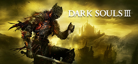
DARK SOULS™ III scores 85/100 — better than 95% of Souls-like capsules (n=450).

Very Positive (1,082 reviews) · $59.99 · Released Apr 11, 2016 · By FromSoftware, Inc.

Quick text summary

DARK SOULS™ III scored 85/100 on Steam Analyzer — Excellent for a Souls-like capsule. Top priority fix: [contrast_color] Add a subtle dark vignette or gradient to the bottom edge to prevent the knight's lower body from blending into Steam's dark background at small and tiny sizes.

Capsule scores by dimension

  • Genre Clarity: 9/10 — Dark fantasy action RPG knight. The heavily armored knight in the left foreground wielding a greatsword, combined with the gothic castle silhouette in the golden-smoke background, instantly communicates dark fantasy action RPG at any size. The fiery ember effects on the armor and the brooding atmosphere reinforce the Souls-like subgenre specifically. At tiny size the armored silhouette and sword remain readable enough to signal the genre clearly.
  • Title Readability: 9/10 — Bold serif title reads at all sizes. The DARK SOULS III logotype uses a large, high-contrast white serif font placed against the warm yellow-gold mid-tone sky background on the right half, creating strong separation. At small and tiny sizes the title compresses but the thick letterforms and wide tracking maintain legibility. The Roman numeral III and the spacing keep it clean with no competing tagline text to muddy the read.
  • Contrast & Color: 8/10 — Strong value separation, warm amber key. The dark armored knight silhouette sits against the warm golden-amber sky, creating a strong light-dark contrast that pops against Steam's dark navy background. In a grayscale mental test the knight reads as a dark mass against a lighter background, preserving silhouette clarity. The bottom portion is darker and could risk blending with Steam's #1b2838 at tiny size, but the overall value range is well managed.
  • Uniqueness & Polish: 8/10 — Iconic series look, premium execution. The composition has a cinematic, high-production quality feel with detailed armor rendering, atmospheric depth, and the signature Souls aesthetic of embers and gothic ruins. It avoids generic fantasy tropes by leaning into the specific visual language of the Dark Souls brand. Compared to benchmarks like Black Myth or Hellblade II it feels slightly conventional within its own series style, but polish is clearly professional.
  • Brand Consistency: 9/10 — Instantly recognizable Souls series identity. The amber-ember color palette, heavily armored lone warrior archetype, gothic architecture in the background, and the distinctive DARK SOULS serif wordmark are all deeply consistent with the series' established identity. Any returning fan would identify this as a FromSoftware Souls title before reading the title. The internal cohesion between character design, color grading, and typography is tight and deliberate.
  • Composition: 8/10 — Clear diagonal hierarchy, effective staging. The composition uses a strong diagonal from the bottom-left knight to the upper-right title text, creating natural eye flow and using the full capsule space efficiently. The knight occupies the left third as the focal character while the title sits in the controlled lighter sky region on the right. At small and tiny sizes the knight silhouette and title still occupy distinct zones without competing, though the castle midground detail is lost at tiny size which is acceptable.

What works

  • Iconic silhouette clarity. The armored knight with greatsword reads as a strong, recognizable silhouette even at tiny thumbnail size against the lighter amber sky.
  • Title placement on controlled background. The DARK SOULS III wordmark is placed precisely over the lighter golden sky region, maximizing contrast and avoiding the noisy armor texture.
  • Warm amber palette pops on Steam dark UI. The golden-yellow and ember color scheme creates immediate visual separation against Steam's #1b2838 navy background during quick scroll.
  • Strong series brand identity. The combination of ember effects, gothic ruins, lone knight, and the signature serif logo makes this instantly recognizable as a Souls title before reading the title.

What hurts the capsule

  • Lower third blends with Steam background. The dark bottom portion of the image with the knight's legs and sword base is very dark and risks merging with Steam's dark UI at tiny size.
  • Castle midground detail lost at tiny size. The gothic castle silhouette in the background, which adds strong genre context, becomes unreadable at thumbnail scale and loses its storytelling contribution.
  • Slightly conventional within genre benchmarks. Compared to peers like Hellblade II or Lies of P, the composition follows a familiar lone warrior pose formula that doesn't offer a surprising visual hook.
  • No dynamic action or tension cue. The knight stands in a static pose rather than in motion or combat, which slightly reduces the sense of action urgency compared to top benchmarks like Space Marine 2.

Priority fixes

  1. [contrast_color] Add a subtle dark vignette or gradient to the bottom edge to prevent the knight's lower body from blending into Steam's dark background at small and tiny sizes.
  2. [composition] Introduce a subtle rim light or brighter edge highlight on the knight's right side to sharpen silhouette separation from the background at tiny size.
  3. [uniqueness_polish] Consider a slight forward-leaning or mid-action pose for the knight to communicate urgency and better compete with top-tier action genre benchmarks.
  4. [genre_clarity] Enhance the castle silhouette contrast in the midground so it contributes readable genre context even when the image is compressed to small capsule size.

Store copy priority fixes

  1. [hook_strength] Rewrite the short description to lead with a core gameplay verb and emotional outcome: e.g., 'Master challenging combat and uncover dark secrets in a world consumed by fire' instead of relying on series pedigree alone.
  2. [feature_communication] Add specific mechanical examples in the detailed description: clarify what 'faster gameplay' means (e.g., stamina management changes, new weapon types), explain build variety, and describe the role of multiplayer/co-op.
  3. [uniqueness] Insert a clear differentiator that explains what Dark Souls III adds to the formula—new enemy types, level design philosophy, narrative scope, or gameplay systems that justify a new entry.
  4. [audience_targeting] Add a sentence addressing newcomers explicitly with reassurance about learning resources, difficulty scaling, or story accessibility to make the 'newcomers alike' claim credible.

Related guides

Steam app ID: 374320 · Tags: Souls-like, Dark Fantasy, Difficult, RPG, Atmospheric