Scoring genre clarity...
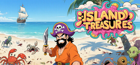
Island Treasures: 2D pixel action-adventure.Play as Jack. Slash or throw daggers.Collect gold & Golden Skulls.Find keys & chests for map fragments. Each world ends with escape: saws, monsters, gunboats, magma. Search hidden walls. Grab 1-ups. Score soars! Golden Skull whispers: treasure or death.
$1.998 user reviews
2D PlatformerPuzzle PlatformerPuzzle
Heguo StudioApr 21, 2026