Scoring genre clarity...

SPACE RABBIT capsule

SPACE RABBIT

A high-stakes challenge action game where a space rabbit sets out for the moon!Can you overcome countless trials and safely return to the moon? Only the gods know!

$6.992 user reviews
AdventureActionAction-Adventure
POKKUN WORLDJul 10, 2025

SPACE RABBIT scores 68/100 — better than 22% of Adventure capsules (n=7,922).

2 user reviews · $6.99 · Released Jul 10, 2025 · By POKKUN WORLD

Quick text summary

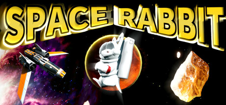
SPACE RABBIT scored 68/100 on Steam Analyzer — Solid for a Adventure capsule. Top priority fix: [uniqueness_polish] Develop a signature visual style or art direction statement—consider stylized particle effects, a cohesive color grading, or distinctive rendering that reflects the game's core aesthetic and differentiates it from generic space templates.

Capsule scores by dimension

  • Genre Clarity: 7/10 — Space action with character focus. The capsule clearly communicates a space-themed action game through the spaceship, asteroids, and cosmic environment scattered across the design. The white rabbit character in the center circle is the memorable hook that sets this apart from generic space shooters. At tiny size, the rabbit silhouette and spaceship remain readable, though the genre leans toward action-adventure rather than pure shooter due to the character focus and moon-return narrative framing.
  • Title Readability: 8/10 — Bold yellow type, excellent contrast. The SPACE RABBIT title uses a thick yellow outline font with dark fill that stands out sharply against the black space background, maintaining excellent legibility at all sizes including tiny thumbnails. The all-caps treatment and generous letter spacing ensure clarity during quick scrolls. Minor weakness: the decorative outline effect adds visual interest but risks slight softening at extreme tiny sizes, though it holds up well in practice.
  • Contrast & Color: 8/10 — Strong value separation and saturation. The bright yellow title, white rabbit, and warm orange/brown asteroid elements create strong value contrast against the deep black space background and purple nebula. The silhouettes remain distinct even at tiny size due to the consistent use of light elements on dark fields. The warm color palette (yellow, orange, white) against cool space elements (purple, dark blue) adds visual appeal without muddiness.
  • Uniqueness & Polish: 6/10 — Charming character, generic space layout. The rabbit mascot and moon-quest premise provide thematic distinctiveness and personality that elevates this above generic space action templates. However, the overall composition—spaceship upper left, centered character portrait, floating asteroids—follows familiar indie game capsule conventions without a standout visual hook or art direction statement. The execution is clean but lacks the premium craft or memorable visual language that distinguishes top-tier indie titles in this space.
  • Brand Consistency: 5/10 — Recognizable character, limited identity cues. The white rabbit is the core brand asset and appears consistent in the capsule design, making it a memorable character icon. However, there are no signature visual motifs, distinctive palette patterns, or secondary identity markers that would allow immediate recognition of Space Rabbit among similar games. The design relies heavily on the rabbit novelty rather than establishing a cohesive visual language that carries across marketing materials.
  • Composition: 7/10 — Clear hierarchy, well-balanced layout. The title anchors the top with strong horizontal dominance, the rabbit character centers as the focal point, and the spaceship and asteroids provide supporting visual interest without competing for attention. The composition reads cleanly at small and tiny sizes due to clear separation of elements and good use of negative space. One minor concern: the scattered asteroids feel somewhat decorative rather than compositionally essential, but they do not harm overall clarity.

What works

  • Title legibility across all sizes. The bold yellow outline font with dark fill maintains crystal clarity at full, small, and tiny sizes, ensuring the game name is never lost in scrolling.
  • Strong visual contrast against dark background. Bright yellows, whites, and warm oranges pop effectively against the black space background and Steam dark UI, creating immediate visual impact.
  • Memorable character focal point. The white rabbit in the center circle is distinctive and charming, giving the capsule a personality hook that differentiates it from generic space action games.
  • Clean composition hierarchy. Title at top, character center, supporting elements (ship, asteroids) around the margins create a logical visual flow that guides the eye efficiently.

What hurts the capsule

  • Generic space environment treatment. The purple nebula, scattered asteroids, and spaceship are common space game visual tropes that do not convey a unique art style or visual identity.
  • Limited brand identity signals. Beyond the rabbit mascot, there are no signature visual motifs, consistent color language, or secondary design elements that would build recognizable brand equity.
  • Decorative elements lack integration. The floating asteroids feel like scattered assets rather than compositional elements that reinforce the core narrative or unique selling point of the game.
  • No premium craft differentiation. While competently executed, the design lacks the polished visual effects, sophisticated typography, or distinctive art direction that characterizes top-performing indie action titles.

Priority fixes

  1. [uniqueness_polish] Develop a signature visual style or art direction statement—consider stylized particle effects, a cohesive color grading, or distinctive rendering that reflects the game's core aesthetic and differentiates it from generic space templates.
  2. [brand_consistency] Introduce a secondary visual motif or icon (moon phase, rabbit silhouette repeating pattern, or space-themed symbol) that reinforces brand identity and becomes recognizable across marketing materials.
  3. [composition] Replace scattered asteroids with purposeful compositional elements that reinforce the moon-quest narrative—such as a moon in the background, a path/trail visual, or environment details that suggest the game's unique challenge structure.

Store copy priority fixes

  1. [hook_strength] Rewrite the short description to lead with a specific, action-forward verb: 'Climb a hazardous alien world by collecting carrots and unlocking new jump abilities—but you'll need to survive three meteor showers to escape.' This communicates challenge and progression, not just premise.
  2. [feature_communication] Restructure the detailed description with a clear 'Core Gameplay' section that bullet-points the main loop: Collect carrots • Unlock jump abilities from NPCs • Survive three meteor shower phases • Reach the moon. Reserve narrative context for a separate 'Story' callout.
  3. [audience_targeting] Add explicit difficulty and playtime signals in the opening of the detailed description, e.g., 'SPACE RABBIT is a challenging platformer designed for action-game fans who enjoy precise controls and speedrun-friendly design—completable in X hours with replayable RTA challenges.'
  4. [uniqueness] Add a 1-sentence differentiator after the short description, such as 'What sets SPACE RABBIT apart: a gravity-twist climbing system where each jump unlock meaningfully changes your approach to the same three meteor showers.'

Related guides

Steam app ID: 3748400 · Tags: Adventure, Action, Action-Adventure, Exploration, 3D