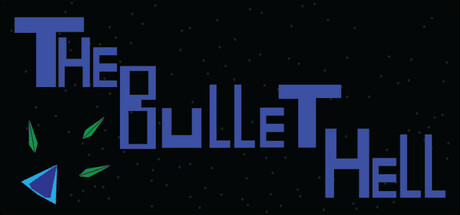
The Bullet Hell scores 60/100 — better than 0% of Bullet Hell capsules (n=1,285).

Quick text summary

The Bullet Hell scored 60/100 on Steam Analyzer — Solid for a Bullet Hell capsule. Top priority fix: [title_readability] Add a subtle dark outline or background box behind the title text to preserve letter definition at TINY size and maintain cohesion across the three-word layout

Capsule scores by dimension

  • Genre Clarity: 7/10 — Bullet-hell action clearly signaled. The scattered green bullet sprites and geometric triangular ship silhouette in the lower left immediately communicate a shoot-dodge action game. At TINY size, the bullet scatter effect and ship shape remain recognizable as arcade-style action, though the specific bullet-hell subgenre is implied rather than visually dominant. The starfield background reinforces a space-action context effectively.
  • Title Readability: 6/10 — Title legible but spacing breaks down. At FULL size the title 'THE BULLET HELL' reads clearly in blue block letters with good contrast against the dark background. However, at TINY size the letter spacing compresses and the three-word layout fragments visually, making it feel less cohesive. The lack of a unifying outline or secondary background box means small letters lose definition at thumbnail scale.
  • Contrast & Color: 7/10 — Strong value separation, clean silhouettes. The bright blue title and cyan-green bullet sprites create excellent contrast against the near-black starfield background, maintaining clear readability even in grayscale. The geometric triangular ship reads as a distinct silhouette. At TINY size the color separation remains effective, though fine details in the bullet trails blur slightly.
  • Uniqueness & Polish: 5/10 — Functional but generic arcade aesthetic. The design uses familiar retro-arcade visual language—simple geometry, bold primary colors, scattered particles—without a distinctive hook or memorable visual signature. While competent, it resembles many indie bullet-hell projects and lacks the premium polish or unique art direction seen in top-tier action titles. The composition feels like a safe, expected template rather than a standout identity.
  • Brand Consistency: 5/10 — Minimal identity cues, generic treatment. The capsule relies on standard bullet-hell iconography (bullets, ship, starfield) without establishing recognizable brand markers or a memorable visual motif. There are no signature character designs, distinctive UI elements, or unique color palette choices that would allow recognition across marketing materials. Without reference to the 6 available screenshots, this capsule alone communicates very little about what makes The Bullet Hell specifically memorable.
  • Composition: 6/10 — Balanced but lacks focal hierarchy. The title dominates the upper and center-right areas while the ship and bullets occupy the lower left, creating rough balance but no clear primary focal point at small sizes. The starfield fills negative space evenly, which is safe but uninspiring. At TINY size the scattered bullet elements and left-positioned ship compete with the title for attention rather than supporting it, and the composition feels slightly scattered rather than unified.

What works

  • Strong color contrast. Blue and cyan elements pop cleanly against the dark background and maintain silhouette clarity even at tiny thumbnail size.
  • Genre-appropriate visual language. Bullet sprites, ship geometry, and starfield immediately communicate arcade action without confusion.
  • Title legible at full size. Block letters with generous spacing ensure the game name reads clearly when viewed at standard header dimensions.

What hurts the capsule

  • Generic template execution. The capsule follows predictable bullet-hell design conventions without establishing a distinctive visual identity or memorable hook.
  • Title fragmentation at tiny scale. The three-word layout loses cohesion when compressed to thumbnail size, and letters lack outline support to maintain definition.
  • Scattered composition focus. Multiple equally-weighted elements (title, bullets, ship, starfield) compete for attention rather than creating a clear visual hierarchy.
  • No brand identity markers. Lacks distinctive character design, icon, or signature palette that would make the capsule recognizable beyond generic bullet-hell imagery.

Priority fixes

  1. [title_readability] Add a subtle dark outline or background box behind the title text to preserve letter definition at TINY size and maintain cohesion across the three-word layout
  2. [uniqueness_polish] Introduce a distinctive character or ship design or signature visual motif that differentiates this bullet-hell from others in the genre
  3. [composition] Anchor a single clear focal point (likely the ship or a unique character element) in the lower third and align the title above it to create unified visual hierarchy at small sizes
  4. [brand_consistency] Develop a signature color accent or UI element visible in this capsule that would be immediately recognizable across all marketing materials

Store copy priority fixes

  1. [hook_strength] Replace "A true bullet-hell game" with a visceral, action-focused opening that emphasizes the specific feeling (e.g., "Survive relentless bullet onslaughts across 24 impossible bosses" or "Master split-second dodging against overwhelming firepower").
  2. [uniqueness] Add 2-3 sentences explaining what differentiates this game: highlight the passive damage mechanic, the scope of 31 characters with distinct playstyles, or what the 4 special modes uniquely offer compared to other bullet-hells.
  3. [feature_communication] Reframe "Simple graphics" and "Simple, uncluttered UI" as intentional design strengths (e.g., "Minimalist visuals keep focus on bullet patterns" or "Streamlined interface removes distractions at high speeds").
  4. [audience_targeting] Add explicit difficulty or audience positioning language (e.g., "Built for arcade veterans and pattern-learning devotees" or "Expect brutal, unforgiving difficulty") to attract the right player mindset.

Related guides

Steam app ID: 3750800 · Tags: Bullet Hell, Arcade, Action, 2D, Score Attack