Scoring genre clarity...

Station 0 - المحطة 0 capsule

Station 0 - المحطة 0

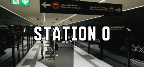
Deep beneath Riyadh lies a forgotten metro station hiding terrifying anomalies. Explore, document, and survive a psychological horror experience that blurs the line between reality and illusion. Welcome to Station 0.

$2.99Positive(26)
ActionAdventurePuzzle
rspyz (Mohammed Aljohani)Jun 8, 2025

Station 0 - المحطة 0 scores 68/100 — better than 17% of Action capsules (n=8,534).

Positive (26 reviews) · $2.99 · Released Jun 8, 2025 · By rspyz (Mohammed Aljohani)

Quick text summary

Station 0 - المحطة 0 scored 68/100 on Steam Analyzer — Solid for a Action capsule. Top priority fix: [uniqueness_polish] Introduce a subtle anomaly, creature silhouette, or visual disruption in the metro scene to hint at the core horror mechanic and differentiate from generic underground settings.

Capsule scores by dimension

  • Genre Clarity: 7/10 — Horror setting clear, genre readable. The underground metro environment with institutional signage, fluorescent lighting, and stark geometric composition immediately signals a psychological horror or exploration-based game. At TINY size, the institutional architecture and color palette (grays, blacks, clinical whites) remain recognizable as a confined, eerie space, though the specific 'anomaly horror' subgenre requires context to fully decode. The bilingual signage (English and Arabic) adds regional authenticity that reinforces the Riyadh metro setting.
  • Title Readability: 8/10 — Title bold and readable across sizes. STATION 0 uses a strong, all-caps serif or semi-serif typeface in white with subtle shadow or outline treatment, positioned centrally over a relatively controlled mid-tone background (the metro corridor). The title maintains excellent legibility at SMALL size and remains readable at TINY, though fine shadow details compress. The bilingual subtitle below is too small to resolve at tiny size but does not interfere with the primary title recognition.
  • Contrast & Color: 7/10 — Strong value separation, slightly muted saturation. The capsule relies on high contrast between the institutional white and gray tones of the metro station against darker shadows and black architectural elements, which separates well from the Steam dark background (#1b2838). White title text pops clearly. However, the overall palette is deliberately desaturated and cool-toned (grays, blacks, whites, dim fluorescents), which reads as intentional atmospheric choice but sacrifices saturation pop compared to competing horror titles; at quick scroll this reads as 'moody' rather than 'striking.'
  • Uniqueness & Polish: 6/10 — Authentic setting, competent execution. The capsule benefits from a specific, culturally grounded setting (Riyadh metro) and clean photographic/rendered composition that feels intentional and premium. The architectural photography style is polished and reads as a real location rather than generic fantasy. However, the visual hook is more 'authentic institutional horror' than distinctly unique; comparable horror titles use similar underground or liminal space tropes (Lethal Company, DREDGE, Chants of Sennaar). The image itself is competent but does not communicate a singular mechanic or visual signature that separates it from other indie horror.
  • Brand Consistency: 6/10 — Coherent institutional aesthetic, limited signature. The capsule establishes a consistent visual language: institutional architecture, harsh lighting, bilingual signage, geometric perspective, and a cool gray-white palette. This creates internal cohesion. However, without access to the nine store screenshots, it is difficult to confirm whether this aesthetic carries a memorable iconography or character identity that would make Station 0 instantly recognizable in future marketing; the current capsule reads as 'this specific location' rather than a franchisable brand motif.
  • Composition: 7/10 — Strong linear depth, centered focal hierarchy. The capsule uses a forced-perspective corridor composition that creates a clear vanishing point and depth layering (foreground platform edge, midground corridor, background signage and exit). The title sits centrally above the midground, not competing with the architectural lines. At SMALL and TINY sizes, the perspective lines guide the eye naturally inward and the title remains the dominant text element. The composition is well-balanced and resilient to cropping, though the centered approach is conventional for horror; no elements are dangerously close to edges or will be cut off by Steam's crop.

What works

  • Title legibility at all sizes. STATION 0 in white with outline treatment remains readable and prominent even at TINY thumbnail size due to strong contrast and bold letterforms.
  • Authentic regional specificity. The bilingual signage and genuine metro architecture create a distinctive, culturally grounded setting that stands apart from generic underground horror tropes.
  • Effective depth composition. Linear perspective and layered spatial arrangement (foreground, midground, background) create a clear focal hierarchy and guide viewer attention naturally.
  • High value contrast separation. White and gray institutional tones separate cleanly from the Steam dark background, ensuring the capsule does not blend into the browsing interface.

What hurts the capsule

  • Desaturated palette lacks punch. The intentionally muted color scheme (grays, whites, blacks, cool tones) reads as moody but does not pop in quick scroll compared to saturated competitors like HELLDIVERS 2 or Lies of P.
  • Generic horror location setup. While authentic, the underground institutional space is a familiar horror setting; the capsule does not clearly communicate a unique mechanic, anomaly visual, or signature design element that distinguishes it from other indie horror exploration games.
  • No character or creature presence. The capsule features only architecture and empty space; the absence of a recognizable threat, character, or core gameplay visual makes the unique selling point unclear at glance.
  • Bilingual subtitle unreadable at TINY. The Arabic and English text below the title compresses into illegibility at thumbnail size, limiting brand reinforcement in that critical viewing context.

Priority fixes

  1. [uniqueness_polish] Introduce a subtle anomaly, creature silhouette, or visual disruption in the metro scene to hint at the core horror mechanic and differentiate from generic underground settings.
  2. [contrast_color] Increase saturation of a key accent color (warm emergency lighting, red warning element, or eerie glow) to improve visual pop at SMALL and TINY sizes while maintaining the institutional mood.
  3. [brand_consistency] Add a recurring visual motif or icon (anomaly symbol, station number branding, or hazard marker) that could anchor recognition across future marketing materials.
  4. [composition] Consider asymmetrical title placement or layering the title over a more visually active secondary element to create dynamic visual interest without sacrificing readability.

Store copy priority fixes

  1. [feature_communication] Clarify the camera documentation mechanic with a concrete gameplay outcome: 'Document anomalies to unlock puzzles and reveal the station's secrets—but some entities actively resist being photographed' to show mechanical integration rather than just flavor.
  2. [uniqueness] Strengthen the cultural specificity claim by adding a single concrete detail about the Riyadh metro setting (e.g., 'inspired by the real architecture and atmosphere of Line 5') to make the regional authenticity feel earned rather than claimed.
  3. [tone_match] Replace 'Immersive sound design' with a tonally consistent descriptor that serves the psychological horror mood, such as 'Suffocating sound design that isolates you from the outside world' to maintain atmospheric consistency.

Related guides

Steam app ID: 3751150 · Tags: Action, Adventure, Puzzle, Realistic, Demons