Quick text summary
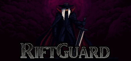
RiftGuard scored 75/100 on Steam Analyzer — Good for a Roguelike capsule. Top priority fix: [genre_clarity] Add subtle visual elements like floating UI orbs, upgrade icons, or enemy silhouettes in the background to hint at the roguelike resource and upgrade loop
Capsule scores by dimension
- Genre Clarity: 7/10 — Dark action roguelike reads clearly. The menacing robed figure with glowing eyes and weapon communicates a dark action game immediately. At tiny size, the silhouette of the creature and the aggressive stance still convey combat-focused gameplay, though the specific roguelike or strategy layer is not obvious from visuals alone. The gothic atmosphere and enemy-like design establish the genre intent well.
- Title Readability: 8/10 — Title stands out with outline style. RIFTGUARD is rendered in a bold serif font with a light outline and shadow effect that maintains readability across full header and small sizes. At tiny size (~120x45), the letterforms remain distinct and legible against the dark background. The placement on the lower portion with generous background space prevents overlap with the character.
- Contrast & Color: 8/10 — Strong value separation and silhouette. The character's light-colored eyes and pale facial features create excellent contrast against the deep purple-black background. The outlined title in light gray/white stands out sharply from the dark backdrop, and the robed figure's dark silhouette with bright accents reads clearly even at tiny thumbnail sizes. Grayscale squint test confirms strong value separation throughout.
- Uniqueness & Polish: 7/10 — Polished dark gothic presentation. The capsule demonstrates intentional art direction with the mysterious robed figure and atmospheric lighting. The ornate serif font treatment and consistent dark palette feel premium and cohesive. However, the design remains within familiar dark fantasy territory without a standout unique hook that distinguishes it from other gothic indie games beyond the core character image.
- Brand Consistency: 7/10 — Consistent gothic identity maintained. The dark palette, gothic character design, and serif title font establish a recognizable brand identity that should carry across marketing materials. The glowing eye detail and robed silhouette create memorable visual cues specific to RiftGuard. Without access to other store assets, the internal consistency of this capsule suggests a deliberate dark fantasy brand direction.
- Composition: 8/10 — Clear focal hierarchy and balance. The character occupies the strong center-upper composition, drawing immediate attention as the primary subject. The title anchors the bottom with adequate margin, creating clear separation between focal point and text. At small and tiny sizes, the layout remains balanced with no critical elements in danger zones, and the dark background provides ample negative space that supports quick visual parsing during scroll.
What works
- High-contrast figure against dark background. The glowing eyes and pale facial features create striking visual separation that reads clearly at all sizes, including tiny thumbnails.
- Legible title with distinctive styling. The outlined serif font maintains readability from full header down to thumbnail size without compression artifacts or blending.
- Clear focal hierarchy and composition. The centered character and bottom-anchored title create intuitive visual flow with excellent balance across the canvas.
What hurts the capsule
- Limited visual uniqueness within genre. The dark robed figure and gothic aesthetic, while well-executed, align closely with common dark fantasy indie game visuals without a distinctive mechanical or art hook.
- Roguelike/strategy layer unclear visually. The capsule effectively communicates dark action but does not visually hint at the resource management, upgrade collection, or roguelike loop that distinguish the gameplay.
- Minimal environmental context. The solid dark background provides strong contrast but offers no glimpse of the game world, enemy variety, or combat scenarios that could enhance gameplay clarity.
Priority fixes
- [genre_clarity] Add subtle visual elements like floating UI orbs, upgrade icons, or enemy silhouettes in the background to hint at the roguelike resource and upgrade loop
- [uniqueness_polish] Consider introducing a distinctive color accent or environmental detail (rift effect, cursed aura) that becomes a recognizable brand motif
- [composition] Layer a subtle semi-transparent battlefield or enemy formation element in the mid-ground to communicate horde combat without cluttering the focal figure
Store copy priority fixes
- [uniqueness] Add a sentence explicitly contrasting RiftGuard's hook against genre standards—e.g., 'Unlike other auto-battlers, RiftGuard [specific mechanic/art style/progression system]' to establish differentiation.
- [feature_communication] Expand the upgrade explanation: clarify what coin purchases (e.g., 'spend coins to unlock and upgrade abilities on the fly'), and explain the blood counter's role in both progression and scoring.
- [audience_targeting] Specify session length and difficulty curve—state whether runs are 5-30 minutes or longer, and whether the game suits quick casual play or longer strategic sessions, to resolve the Casual tag tension.
Related guides
Steam app ID: 3752220 · Tags: Roguelike, Strategy, Auto Battler, Casual, Pixel Graphics