Scoring genre clarity...

Citizen Pain capsule

Citizen Pain

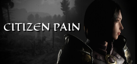
Citizen Pain is a first-person dark fantasy action game. Play as Catherina, warrior princess of the Moges Empire, who gains the supernatural force known as Pain and leads the fight against the Undead King. Classic single-player combat meets modern visuals in this skill-based indie experience.

$9.994 user reviews
ActionHack and SlashFirst-Person
Alessandro CaprioloDec 5, 2025

Citizen Pain scores 68/100 — better than 17% of Action capsules (n=8,534).

4 user reviews · $9.99 · Released Dec 5, 2025 · By Alessandro Capriolo

Quick text summary

Citizen Pain scored 68/100 on Steam Analyzer — Solid for a Action capsule. Top priority fix: [uniqueness_polish] Add a subtle visual effect (e.g., crimson aura, pain-themed glow, or UI element) around the character to hint at the 'Pain' supernatural power and differentiate from generic fantasy.

Capsule scores by dimension

  • Genre Clarity: 7/10 — Dark fantasy action readable. The profile silhouette of an armed warrior against a misty forest backdrop clearly signals fantasy action gameplay. At TINY size, the character pose and atmospheric setting remain discernible, though fine armor details blur. The dark tone and weaponry exclude confusion with other genres, establishing dark fantasy action as the primary read.
  • Title Readability: 8/10 — Strong serif title legibility. CITIZEN PAIN uses a bold serif font positioned in the upper-left quadrant with excellent contrast against the darker background. At SMALL and TINY sizes, the title maintains clarity due to letterform weight and strategic placement away from the busy character detail. No tagline clutter or decorative elements compromise readability at any viewing size.
  • Contrast & Color: 7/10 — Good value separation overall. The white title text pops cleanly against the dark teal-gray forest background, creating strong luminance contrast. The character silhouette benefits from rim lighting that separates her from the atmospheric mist. At TINY size, the grayscale test shows clear light-dark separation between the character and background, though some mid-tone armor detail softens the silhouette slightly.
  • Uniqueness & Polish: 6/10 — Competent but generic execution. The capsule presents a moody, professional dark fantasy aesthetic with atmospheric forest mist and a warrior protagonist in profile—a visual approach common among action-fantasy titles like Lies of P and Hellblade II. While crafted cleanly, the composition relies on familiar tropes (warrior, mist, profile pose) without a distinctive visual hook or mechanic callout that signals what makes Citizen Pain unique. The supernatural 'Pain' power is not visually communicated.
  • Brand Consistency: 6/10 — Recognizable character, limited cues. The character Catherina is presented consistently as the focal point, establishing her as a recognizable brand anchor across marketing. However, no distinctive color palette, symbol, or visual motif emerges from this single capsule that would create instant franchise recognition. The muted cool-gray palette is functional but not particularly memorable or iconic compared to top-tier action titles.
  • Composition: 7/10 — Clear focal point, effective balance. The character positioned in the right-center creates a strong primary focal point, with the title anchored safely to the upper-left to avoid clipping. The atmospheric forest background provides depth layering without overwhelming the character. At SMALL size the hierarchy remains clear; at TINY size, the character silhouette and title are both legible, though subtle armor texture becomes lost.

What works

  • High-contrast title placement. Bold serif 'CITIZEN PAIN' positioned in a controlled upper-left zone ensures readability at all viewing sizes without fighting the character focus.
  • Strong character silhouette. The warrior profile with rim lighting creates clear separation from the atmospheric background, maintaining visual clarity even at TINY thumbnail size.
  • Professional atmospheric tone. Moody forest mist and cool color palette establish a cohesive dark fantasy mood that signals action-adventure gameplay immediately.

What hurts the capsule

  • Generic dark fantasy visual language. The profile warrior pose, misty forest, and muted palette follow familiar conventions from competing titles, offering no distinctive visual identity or unique selling point.
  • Supernatural mechanic not communicated. The 'Pain' power that defines the game's core identity is invisible in the capsule; no visual effect, aura, or iconic symbol hints at this unique gameplay element.
  • Limited color distinctiveness. Cool gray-teal palette is functional but unmemorable; lacks saturation or distinctive hue that would create instant brand recall versus competitors.

Priority fixes

  1. [uniqueness_polish] Add a subtle visual effect (e.g., crimson aura, pain-themed glow, or UI element) around the character to hint at the 'Pain' supernatural power and differentiate from generic fantasy.
  2. [brand_consistency] Introduce a signature color accent (warm gold, deep crimson, or other distinctive hue) to the character's armor or environment to create a memorable, recognizable brand palette.
  3. [genre_clarity] Consider a subtle HUD or first-person perspective element in the corner to reinforce the first-person action gameplay claim and stand out from third-person action competitors.

Store copy priority fixes

  1. [uniqueness] Replace 'inspired by classic old-school titles' with a specific description of what the Pain mechanic does in combat (e.g., 'harness the Pain ability to execute devastating finishing moves' or 'unlock supernatural combos that turn desperation into power').
  2. [feature_communication] Expand the weapons bullet point to include concrete examples: 'Discover and master unique melee weapons—each with distinct combos, special abilities, and playstyles that challenge your approach to every enemy.'
  3. [hook_strength] Consider opening with Catherina's emotional or mechanical hook rather than title repetition. Rewrite to: 'Wield the supernatural force of Pain as Catherina, a warrior princess who must master brutal first-person combat to stop the Undead King's reign.'
  4. [audience_targeting] Add a sentence addressing difficulty flexibility or intended player skill level, such as: 'Designed for players who crave precise, punishing combat—with adjustable difficulty options for those who prefer narrative focus.'

Related guides

Steam app ID: 3752240 · Tags: Action, Hack and Slash, First-Person, Dark, Fantasy