Scoring genre clarity...

Bloodthirsty Sword capsule

Bloodthirsty Sword

《Bloodthirsty Sword 》is a top-down fantasy action-adventure game where you will fight non-stop in order to survive, thus embarking on an adventure full of excitement and thrills

$2.99No user reviews
AdventureActionRPG
月龙千叶Nov 20, 2025

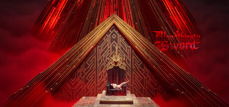
Bloodthirsty Sword scores 63/100 — better than 7% of Adventure capsules (n=7,922).

No user reviews · $2.99 · Released Nov 20, 2025 · By 月龙千叶

Quick text summary

Bloodthirsty Sword scored 63/100 on Steam Analyzer — Solid for a Adventure capsule. Top priority fix: [title_readability] Add a bold dark outline or white stroke to the 'Bloodthirsty Sword' logo to maintain readability below 231px width.

Capsule scores by dimension

  • Genre Clarity: 7/10 — Fantasy action established via setting. The ornate Asian-inspired temple architecture, glowing red energy, and centered altar with figure clearly communicate a fantasy action game with mystical elements. At TINY size, the red glow and temple structure remain recognizable, though specific genre details like combat mechanics blur into ambiguity between action-RPG and action-adventure.
  • Title Readability: 6/10 — Title readable at full, struggles tiny. The 'Bloodthirsty Sword' logo in red text sits top-right against the dark red background, legible at full size but loses clarity at TINY due to thin letterforms and insufficient outline contrast against the warm background. The title placement avoids major clutter but remains vulnerable to small screen collapse.
  • Contrast & Color: 7/10 — Strong red value separation works. The bright red neon lines and glowing effects create excellent value separation against the dark crimson-brown background, and the golden temple geometry maintains readable silhouettes. However, at TINY size the overall warm palette (red-orange-brown) collapses toward mid-tone mud, reducing edge clarity of architectural details.
  • Uniqueness & Polish: 6/10 — Competent mystical aesthetic, generic execution. The temple interior with neon lighting shows intentional art direction and creates a memorable mood, but the composition relies on familiar oriental mysticism tropes without a distinctive mechanical or narrative hook visible. The glowing beam effects are well-executed but feel like a standard premium fantasy template rather than a signature visual identity.
  • Brand Consistency: 5/10 — Limited identity cues, unclear recognition. The capsule shows no recurring character, symbol, or distinctive palette signal that would make the game immediately recognizable on repeat viewing. The golden temple and red energy are thematically consistent with the title but lack a memorable brand motif or signature visual that differentiates it from other oriental fantasy action games.
  • Composition: 7/10 — Strong symmetry, clear focal hierarchy. The centered temple altar creates a powerful focal point with clear depth layering: foreground figure, midground temple structure, and background neon beams that guide the eye upward. The symmetrical composition works well at all sizes, though the equal emphasis between title placement and central subject slightly dilutes primary hierarchy at SMALL viewing.

What works

  • Strong value contrast. Bright red and golden elements separate clearly from the dark background at full size, maintaining silhouette legibility through the neon glow effect.
  • Clear focal point. The centered altar and figure create an unambiguous primary subject that anchors the composition and guides attention at all scales.
  • Thematic coherence. The temple setting, mystical architecture, and weapon-focused title align to establish a unified fantasy action identity.

What hurts the capsule

  • Title readability at tiny scale. The red serif/thin-stroke lettering in 'Bloodthirsty Sword' lacks sufficient outline or contrast to remain clearly legible when scaled below 120 pixels.
  • Weak brand differentiation. The composition relies on recognizable oriental mysticism visual language without a unique character, icon, or signature aesthetic that stands apart from competitor capsules.
  • Mid-tone color collapse. At TINY size, the warm color palette (red, orange, brown) converges toward a muddy middle value, reducing architectural detail clarity and edge definition.

Priority fixes

  1. [title_readability] Add a bold dark outline or white stroke to the 'Bloodthirsty Sword' logo to maintain readability below 231px width.
  2. [contrast_color] Introduce a cool-tone accent (teal, purple, or white glow) to the neon beams to break the warm-only palette and improve tiny-size separation.
  3. [uniqueness_polish] Incorporate a distinctive character silhouette or iconic sword design at the altar focal point to create a memorable brand symbol for recognition across future marketing.

Store copy priority fixes

  1. [hook_strength] Rewrite the short description to lead with the blood-sword symbiosis premise: 'A blade that feeds on your enemies' essence—but grows hungrier each day. Survive its demands or become the next meal.' This uses the unique hook immediately.
  2. [feature_communication] Add a brief concrete example for each system: e.g., 'Allocate points to Strength for heavy attacks or Agility for evasion; unlock skills like Whirlwind Slash through weapon progression.' Show cause-and-effect rather than naming systems.
  3. [tone_match] Hire a native English speaker to revise all copy for grammar and voice consistency, prioritizing the thematic dark tone: replace 'non-stop killing' with language that reinforces the blood-pact atmosphere.
  4. [audience_targeting] Add one sentence explicitly defining the intended player: 'Perfect for action-roguelike veterans who want tactical combat' or 'Designed for players who love fast-paced, skill-based action.' Remove the QQ group link and developer notes from the store copy.

Related guides

Steam app ID: 3754580 · Tags: Adventure, Action, RPG, 3D Fighter, Action-Adventure