Quick text summary
Cheat Death scored 77/100 on Steam Analyzer — Good for a Strategy capsule. Top priority fix: [uniqueness_polish] Add a distinctive visual motif or character silhouette (e.g., a stylized Grim Reaper holding dice, or a cursed card/token shape) that becomes an iconic brand symbol for future marketing
Capsule scores by dimension
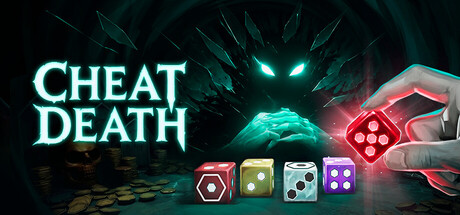
- Genre Clarity: 8/10 — Dice poker strategy immediately apparent. The four colorful dice in the lower center, glowing hand UI element, and central glowing orb all strongly signal a strategy game with dice mechanics and supernatural/dark fantasy tone. At tiny size, the dice silhouettes remain readable and the glowing cyan/red color scheme reinforces the mystical card/board game aesthetic common to roguelites like Balatro and Buckshot Roulette. The Grim Reaper skull imagery above confirms the death-themed narrative hook.
- Title Readability: 8/10 — Bold cyan title stands out cleanly. CHEAT DEATH uses a strong cyan glow outline on black background in the upper left, creating excellent contrast and legibility at all sizes including tiny. The letterforms are bold and geometric without decorative loss of clarity. At small and tiny sizes, the title remains the primary text focal point with no competing secondary text, ensuring it reads quickly on quick scroll.
- Contrast & Color: 8/10 — Strong cyan-red separation on dark. The cyan glowing title and orb create sharp value contrast against the dark teal/black background (#1b2838 compatible), while the red glowing hand and dice add warm accent separation in the mid-right. The grayscale silhouette test shows clear distinction between the bright elements (dice, orb, hand glow) and the dark environment, with no muddy mid-tone collapse. The color hierarchy reads cleanly even when squinting, with cyan and red as the dominant attention drivers.
- Uniqueness & Polish: 7/10 — Polished but treads familiar roguelite path. The execution is clean—glowing effects, crystalline dice, supernatural hand gesture—and the dice poker concept is visually distinct from pure deck builders like Balatro. However, the dark supernatural + glowing UI aesthetic is well-established in the roguelite space (Hades II, Dredge, Buckshot Roulette), so while competently rendered, it lacks a truly memorable or unexpected visual hook. The composition feels premium but not breakthrough.
- Brand Consistency: 7/10 — Consistent dark mystical identity. The cyan glow, dark teal palette, crystalline dice, and skeletal death motifs form a coherent visual identity that should remain recognizable across marketing materials. The glowing hand and dice are signature mechanics-specific cues that communicate 'rigged dice game' as a core identity. Internal rendering is consistent (all glows use the same cyan/red scheme, all surfaces share the matte-to-gloss lighting model), though the identity is not yet iconic enough to stand alone in a crowded roguelite field.
- Composition: 8/10 — Clear hierarchy, dice center focal point. The layout uses effective depth: dark background, mid-layer skull/orb, foreground hand and dice at bottom-center creating a natural focal progression. The title anchors upper left without blocking center interest, and the four dice act as a secondary focal anchor that communicates the core mechanic at a glance. At small and tiny sizes, the dice remain the primary focal point with no clutter, and the composition resists edge cropping with safe margins on all sides.
What works
- Glowing cyan title pops immediately. The CHEAT DEATH logo uses sharp cyan outline glow on dark background, ensuring it remains readable and striking at tiny sizes even during quick scrolling.
- Dice clearly communicate core mechanic. The four distinct colorful dice in the center-lower area are instantly recognizable as the game's primary interaction element and read cleanly at all sizes.
- Strong dark palette with warm accents. The teal-black background with cyan and red glowing elements creates excellent contrast separation that reads well in grayscale and against Steam's #1b2838 background.
- Focused composition, no competing elements. The layout avoids clutter and scattered attention, with clear foreground (hand, dice), midground (skull orb), and background (dark environment) depth layering.
What hurts the capsule
- Familiar supernatural roguelite aesthetic. The dark + glowing cyan UI style is well-trodden territory in games like Hades II and Buckshot Roulette, making the capsule feel competent but not visually distinctive in a crowded indie space.
- Limited brand memorability. While internally consistent, the visual identity (glowing dice, skeleton, cyan light) lacks a truly iconic or unexpected signature that would make it instantly recognizable in isolation.
- Skull orb element lacks clear purpose. The glowing orb at center-top reads as decorative atmosphere rather than communicating a specific mechanic or story beat, creating mild visual ambiguity about the game's central conflict.
Priority fixes
- [uniqueness_polish] Add a distinctive visual motif or character silhouette (e.g., a stylized Grim Reaper holding dice, or a cursed card/token shape) that becomes an iconic brand symbol for future marketing
- [composition] Consider moving the glowing skull orb slightly lower or integrating it more clearly as the 'Death' opponent in the foreground to sharpen the player-vs-Reaper narrative clarity
- [title_readability] Ensure the title outline thickness remains consistent at the smallest Steam thumbnail size (120×45); test render at that scale to confirm no pixel collapse
Store copy priority fixes
- [feature_communication] Add a sentence clarifying mini-games' role: 'Survive deadly mini-games that trigger between poker matches—a single loss ends your run' or similar to establish run structure.
- [uniqueness] Rewrite the opening to emphasize what makes this different: 'Play dice poker against Death—the only roguelite where you cheat, sabotage, and rig probability with cursed items while navigating multiple game modes.' This positions the cheating mechanic as a core differentiator.
- [audience_targeting] Add a sentence targeting secondary audience: 'If you love roguelikes with heavy build crafting and player agency, or tabletop strategy games, this is for you.' This bridges the strategy and narrative-choice audiences.
- [feature_communication] Expand the CHOOSE YOUR PATH section to clarify mechanical impact: 'Six endings based on your choices—saving, punishing, or ignoring souls changes your synergies and available upgrades throughout the run.' Connects narrative to gameplay progression.
Related guides
Steam app ID: 3756340 · Tags: Strategy, Roguelite, Deckbuilding, Dice, First-Person