Scoring genre clarity...
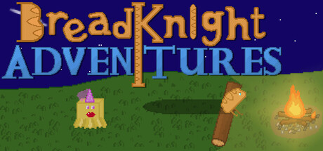
Embark on an Adventure with BreadKnight and his crew to face the fearsome AntiBread! Many quests to complete with hilarious dialogue, and mysterious characters. Turn based combat, defeat your enemies by slapping them with baguettes or cheese! Beware: Dangerous to individuals with a lack of humour.
$4.99No user reviews
AdventureCasualAction RPG
Evergreen DeveloperJul 31, 2025