Project:M scores 70/100 — better than 30% of Indie capsules (n=11,449).

Quick text summary

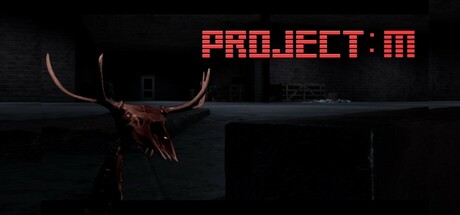
Project:M scored 70/100 on Steam Analyzer — Good for a Indie capsule. Top priority fix: [uniqueness_polish] Introduce a distinctive visual element—such as an iconic symbol, mechanic hint, or art style variation—that visually separates PROJECT:M from generic indie horror and telegraphs its core puzzle or strategy identity.

Capsule scores by dimension

  • Genre Clarity: 7/10 — Horror atmosphere reads clearly. The skeletal deer skull with prominent antlers and dark industrial setting immediately signal horror/dark themes, supported by the moody lighting and abandoned structure. At tiny size, the skull silhouette remains recognizable and gothic, though the puzzle or strategy elements are not visually communicated. The visual language aligns with horror expectations but doesn't distinctly indicate indie puzzle or strategy gameplay.
  • Title Readability: 8/10 — Bold pixelated title stands out. PROJECT:M in bright red pixelated font is positioned clearly in the upper right, creating strong contrast against the dark background and remaining legible at small and tiny sizes. The geometric pixel aesthetic reinforces the indie game identity. The colon formatting and consistent letterforms ensure the title survives compression and quick scrolling without collapse.
  • Contrast & Color: 8/10 — Strong red against dark palette. The bright red pixelated title pops sharply against the near-black background, and the warm reddish-brown skull provides visual interest in the dark composition. The value separation is clear in grayscale, with the skull reading as a distinct silhouette despite low overall luminance. The limited but intentional warm tones create effective focal point hierarchy without muddiness.
  • Uniqueness & Polish: 6/10 — Competent but generic horror setup. The skeletal deer skull in an industrial setting is a recognizable horror motif, and the pixelated title font adds indie charm, but the overall composition resembles common dark horror puzzle game aesthetics without a distinctive visual hook or memorable unique selling point. The execution is clean, but the concept feels familiar in the indie horror space and lacks visual storytelling about what makes this puzzle game stand out mechanically.
  • Brand Consistency: 6/10 — Cohesive horror style, limited identity. The rendering style is internally consistent—dark photorealistic skull contrasted with pixelated title—creating a unified indie horror aesthetic. However, there are no distinctive iconic motifs, symbols, or character elements that would make this capsule uniquely recognizable as PROJECT:M rather than another generic indie horror title. The palette and tone are cohesive but generic within the genre.
  • Composition: 7/10 — Clear focal point with good depth. The skull is positioned as the clear primary subject in the left-center area, with the title anchored top-right, creating an intentional hierarchical layout. The layered depth from the industrial background through the skull to the foreground works well at all sizes. At tiny size, the composition compresses effectively, though the mid-ground industrial detail becomes noise; the title placement in the upper right avoids Steam crop concerns.

What works

  • Title contrast and readability. The bright red pixelated PROJECT:M remains legible and punchy at all sizes, from full header to tiny thumbnail, and the geometric pixel font reinforces indie identity.
  • Dark atmosphere consistency. The moody lighting, skeletal imagery, and industrial setting create a cohesive horror mood that immediately communicates the game's tone and genre intent.
  • Composition hierarchy. The skull and title placement create clear focal points without scattered attention, and the depth layering prevents a flat, compressed read at smaller sizes.

What hurts the capsule

  • Generic horror visual language. The skeletal skull in a dark industrial space is a familiar horror trope without distinctive visual elements that differentiate PROJECT:M from similar indie horror titles.
  • Missing gameplay communication. The capsule does not visually hint at the puzzle or strategy mechanics, leaving potential players uncertain about what they'll actually play beyond 'dark horror.'
  • Limited brand identity signals. There are no iconic characters, motifs, or signature visual elements that would allow recognition of PROJECT:M in a crowded storefront or second viewing.

Priority fixes

  1. [uniqueness_polish] Introduce a distinctive visual element—such as an iconic symbol, mechanic hint, or art style variation—that visually separates PROJECT:M from generic indie horror and telegraphs its core puzzle or strategy identity.
  2. [genre_clarity] Add subtle UI elements, glitch effects, or compositional cues that hint at puzzle-solving or strategic gameplay without sacrificing the horror atmosphere.
  3. [brand_consistency] Develop a recognizable visual motif or signature palette element that can anchor brand identity across store materials and make the capsule memorable on repeat viewings.

Store copy priority fixes

  1. [hook_strength] Replace 'Indie Horror puzzle game' with a verb-forward hook such as 'Survive an abandoned warehouse filled with monsters and dark secrets—solve puzzles, find keys, and escape the shadows.' This immediately conveys action and danger.
  2. [feature_communication] Expand the Gameplay section with 2–3 sentences describing puzzle difficulty, monster behavior, and exploration scope—answer 'How long?' and 'How hard?' to set expectations.
  3. [uniqueness] Add 1–2 sentences explaining what makes Project:M distinct—e.g., unique puzzle mechanic, branching escape routes, or a narrative twist—to differentiate from genre peers.
  4. [tone_match] Proofread and standardize capitalization and grammar throughout (fix 'wearhouse,' 'happed,' lowercase sentence starts) to restore professionalism and match the dark tone of the game.

Related guides

Steam app ID: 3758630 · Tags: Indie, Horror, Action, Strategy, Survival Horror