Scoring genre clarity...

DEATH TRAIN!!! Samara – Voronezh. capsule

DEATH TRAIN!!! Samara – Voronezh.

An exhilarating visual novel blending thriller and dark comedy. A tale of a train, money, greedy people, and bears.

$2.99Very Positive(74)
Visual NovelComedyAnime
mitchaAug 22, 2025

DEATH TRAIN!!! Samara – Voronezh. scores 75/100 — better than 78% of Visual Novel capsules (n=1,147).

Very Positive (74 reviews) · $2.99 · Released Aug 22, 2025 · By mitcha

Quick text summary

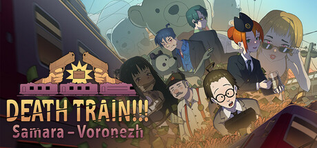
DEATH TRAIN!!! Samara – Voronezh. scored 75/100 on Steam Analyzer — Good for a Visual Novel capsule. Top priority fix: [title_readability] Increase subtitle 'Samara – Voronezh' font size or add subtle background panel behind it to ensure readability at TINY thumbnail size without sacrificing current title strength.

Capsule scores by dimension

  • Genre Clarity: 7/10 — Visual novel with comedic tone evident. The assembled cast of characters and illustrated art style clearly signal a narrative-driven visual novel. At TINY size, the character lineup and warm color palette read as indie/casual adventure, though the specific 'dark comedy thriller' angle is not immediately apparent from visuals alone. The sun logo with 'DEATH TRAIN' text gives a slight ominous edge that hints at unconventional tone.
  • Title Readability: 8/10 — Bold title legible, subtitle harder tiny. The 'DEATH TRAIN!!!' text in large golden-yellow letters reads clearly at all sizes due to strong contrast against the muted background and strategic placement in the upper left. The subtitle 'Samara – Voronezh' becomes difficult to parse at TINY size due to smaller letterforms and lower contrast, but the primary title remains strong and memorable throughout viewing conditions.
  • Contrast & Color: 8/10 — Warm palette pops against dark Steam background. The golden sun logo and warm yellow title text provide excellent value separation from the cool blue-gray sky and dark brown earth tones. Character silhouettes read clearly with good edge definition even at small sizes, and the warm color temperature naturally contrasts with Steam's #1b2838 dark background. Grayscale test shows maintained silhouette separation throughout the composition.
  • Uniqueness & Polish: 7/10 — Illustrated style distinct, execution competent. The hand-drawn character art and warm color palette distinguish this from generic visual novel templates, with a cohesive indie storybook aesthetic. The composition and character arrangement show intentional design rather than random asset placement. However, the approach remains within expected indie visual novel conventions—polished but not exceptionally distinctive compared to top-tier genre peers like DAVE THE DIVER or Chants of Sennaar.
  • Brand Consistency: 7/10 — Consistent illustration style, recognizable palette. The illustrated character art maintains consistent line weight, shading style, and color treatment across all visible figures. The warm golden sun icon establishes a memorable brand motif that could recur across marketing. Internal cohesion is strong, though without reference to store screenshots, the capsule demonstrates a unified art direction that should align well with a story-driven visual novel presentation.
  • Composition: 8/10 — Clear hierarchy, balanced character arrangement. The sun logo anchors the upper left with title, creating a strong entry point, while the ensemble cast fills the right and center with good depth layering—foreground characters overlap midground, establishing visual hierarchy. At TINY size, the composition remains readable with the logo and title securing clear focus. Character arrangement avoids dead center void and maintains edge safety with intentional spacing that survives Steam's standard cropping.

What works

  • Strong title contrast and placement. Golden 'DEATH TRAIN!!!' text in upper left reads clearly at all sizes with excellent contrast against background and strategic positioning that prioritizes legibility.
  • Cohesive illustrated aesthetic. Hand-drawn character art and warm color palette create a distinctive indie visual novel look with consistent rendering style across all figures.
  • Effective depth and silhouettes. Overlapping character arrangement and varied figure sizes create visual depth that guides the eye and maintains clarity even at TINY thumbnail size.

What hurts the capsule

  • Subtitle legibility at small sizes. The secondary 'Samara – Voronezh' text becomes difficult to read at TINY size due to reduced letterforms and insufficient contrast separation.
  • Limited visual uniqueness in concept. While well-executed, the illustrated ensemble cast and warm color palette follow expected indie visual novel conventions without a standout mechanic or unique selling point visible in the capsule.
  • Tonal mismatch not clearly telegraphed. The dark comedy thriller tone mentioned in description is not strongly implied by the visuals alone—the cheerful warm palette and friendly character poses read more light-hearted than the 'thriller' framing suggests.

Priority fixes

  1. [title_readability] Increase subtitle 'Samara – Voronezh' font size or add subtle background panel behind it to ensure readability at TINY thumbnail size without sacrificing current title strength.
  2. [genre_clarity] Add a subtle visual element or UI hint that reinforces the dark comedy thriller tone—consider slight color adjustment to one character's expression or a small ominous detail that hints at the train's danger without conflicting with the warm palette.
  3. [uniqueness_polish] Emphasize the core 'money, greedy people, and bears' hook with a visual element unique to this game—a glimpse of a bear or monetary visual that distinguishes it from generic visual novel peers.

Store copy priority fixes

  1. [hook_strength] Rewrite the opening line to lead with the absurdist premise: 'A door salesman stumbles onto a suitcase of cash aboard a doomed Russian train. This is a dark comedy thriller about greed, chaos, and bears.' This trades generic 'exhilarating' language for the actual weird draw.
  2. [feature_communication] Add one sentence after the feature list explicitly stating: 'This is a linear kinetic novel with no player choices—sit back and experience the story unfold.' This sets correct expectations and distinguishes from choice-driven visual novels.
  3. [uniqueness] Insert a differentiating statement in the detailed description such as: 'Unlike traditional visual novels, this kinetic experience prioritizes absurdist humor and satirical commentary over emotional choices.' This clarifies what makes the writing approach distinctive.
  4. [audience_targeting] Clarify tone with a single sentence: 'If you enjoy dark comedy, Russian culture satire, and stories that don't take themselves seriously, this 90-minute absurdist thriller is for you.' This helps the right player self-identify.

Related guides

Steam app ID: 3762650 · Tags: Visual Novel, Comedy, Anime, Thriller, Dark Humor