Scoring genre clarity...
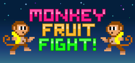
Monkey Fruit Fight! mixes PvP retro arcade vibes and modern competitive action! Master precise platforming and throw fruit weapons in intense pixel art duels. Dominate friends to an electrifying synthwave soundtrack! Easy to learn, difficult to master - perfect for all ages!
$12.992 user reviews
Early AccessCompetitiveArcade
Andreas & Mango Studios ABAug 18, 2025