Scoring genre clarity...

Curtains The Clown capsule

Curtains The Clown

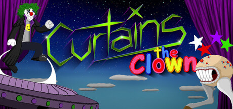
Meet Curtains. An exiled alien clown in search of a home. While passing through a distant galaxy, he was forced to land when his ship's fuel cells ran dry. Now stranded in a far away world, Curtains must find fuel for his ship and return to space... or perhaps another way to continue his journey?

$2.996 user reviews
AdventureSingleplayer2D Platformer
GrimClownJayNov 6, 2025

Curtains The Clown scores 63/100 — better than 7% of Adventure capsules (n=7,922).

6 user reviews · $2.99 · Released Nov 6, 2025 · By GrimClownJay

Quick text summary

Curtains The Clown scored 63/100 on Steam Analyzer — Solid for a Adventure capsule. Top priority fix: [title_readability] Thicken the stroke weight of "Curtains" outline and remove decorative angles to increase legibility at tiny size; ensure the main title remains readable at 120px width.

Capsule scores by dimension

  • Genre Clarity: 7/10 — Clear comedic adventure with alien setting. The cartoon clown character with exaggerated grin, alien spaceship silhouette on left, and colorful star elements immediately signal a comedic adventure game. At tiny size, the character and ship remain identifiable, though the specific "clown" theme becomes less distinct—it reads more as generic cartoon adventure. The vibrant palette and whimsical tone clearly avoid horror or serious action genres.
  • Title Readability: 5/10 — Title split across two lines, moderate legibility. The main title "Curtains" in yellow-green outline is readable at full size but becomes fuzzy and harder to parse at tiny size due to thin stroke weight and decorative angles. The word "clown" in red-pink below adds context but is barely legible at 45px height. The outline approach helps separation from background, but the decorative geometry sacrifices clarity at small scales.
  • Contrast & Color: 7/10 — Good separation with vibrant hues against dark sky. The yellow-green title and red-pink "clown" text contrast well against the deep blue night sky and purple curtain borders, creating clear value separation. The white character and cream-colored clown head on the right read distinctly in grayscale. At tiny size, the overall composition still pops due to saturated foreground elements, though fine details blur together slightly.
  • Uniqueness & Polish: 6/10 — Competent cartoon style, generic execution. The illustration is clean and well-drawn with good character expressiveness and a cohesive cartoon aesthetic. However, the composition feels like a standard character showcase with space scenery backdrop—no distinctive visual hook communicates the core mechanic or unique selling point beyond "it's a funny clown game." Compared to standout indie capsules like DAVE THE DIVER or Slay the Princess, the concept feels more template-like despite solid craft.
  • Brand Consistency: 6/10 — Consistent cartoon style, limited identity signals. The art style is internally cohesive with matching illustration quality, consistent color palette (purples, blues, yellows, reds), and a recognizable character. However, without seeing other marketing materials, the capsule lacks a memorable signature motif or iconic symbol that would distinguish Curtains from other indie cartoon games. The clown character is the primary identity anchor, but the overall presentation reads as generically cute rather than distinctively branded.
  • Composition: 7/10 — Clear focal point, good depth, minor edge concerns. The clown character anchors the right side as primary focus with the alien ship balancing on the left, creating a stable diagonal composition. Depth layering is present: purple curtain border frames, starry background, cloud midground, and foreground elements. At tiny size this reads well as a coherent scene. The title placement across the center works but the small "clown" tagline sits close to the right edge and may crop unpredictably on some Steam layouts.

What works

  • Strong character expression. The clown's exaggerated grin and body language immediately communicate personality and tone, making the character memorable even at small sizes.
  • Effective color contrast against dark background. Saturated yellows, reds, and greens stand out cleanly against the deep blue sky and purple frame, maintaining visibility across all viewing sizes.
  • Balanced composition with clear focal points. The ship-left and clown-right arrangement creates visual interest without clutter, supported by depth layering from foreground to background elements.

What hurts the capsule

  • Title legibility at small scales. Thin decorative lettering and angled geometry in "Curtains" becomes unclear at tiny size, and "clown" tagline is barely readable below 45px height.
  • Generic visual hook. The composition is a standard character-plus-setting showcase that does not visually communicate a unique mechanic or distinctive concept beyond "whimsical clown adventure."
  • Secondary text placement vulnerability. The red "clown" subtitle sits near the right edge of the frame and risks being cut off or cropped depending on Steam's layout rendering, reducing brand clarity.

Priority fixes

  1. [title_readability] Thicken the stroke weight of "Curtains" outline and remove decorative angles to increase legibility at tiny size; ensure the main title remains readable at 120px width.
  2. [composition] Reposition the "clown" tagline to be centered or anchored within the safe zone away from right edge to prevent crop-related visibility loss across Steam layouts.
  3. [uniqueness_polish] Add a subtle visual element that hints at the core mechanic (fuel cells, space travel, or stranded survival) to differentiate from generic cartoon adventure games.
  4. [genre_clarity] Consider adding a small UI element or visual cue (like a fuel gauge or crashed ship detail) at full size that clarifies the sci-fi survival angle without cluttering the composition.

Store copy priority fixes

  1. [hook_strength] Rewrite the short description opening to lead with a visceral verb or emotional stakes: 'Stranded on a hostile alien world, help Curtains the clown escape—or discover a stranger fate waiting in the shadows' instead of passive setup.
  2. [feature_communication] Add 2-3 sentences describing the world's visual atmosphere and hazard types (e.g., 'Navigate toxic environments, crumbling platforms, and environmental puzzles') to give players a concrete mental image of moment-to-moment gameplay.
  3. [uniqueness] Insert 1-2 sentences after the ending section explaining what makes Curtains' journey or world mechanically or narratively distinct—e.g., how the 6 endings meaningfully diverge or how the nonlinear world creates emergent exploration.
  4. [audience_targeting] Add a single sentence clarifying which player type this is for: 'Perfect for platformer fans who love discovering multiple solutions and secret endings' or 'Ideal for casual players seeking accessible 2D adventure without time pressure.'

Related guides

Steam app ID: 3766820 · Tags: Adventure, Singleplayer, 2D Platformer, Exploration, Side Scroller