Scoring genre clarity...
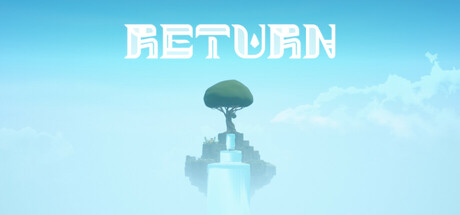
[RETURN] is a puzzle adventure game. When sudden disaster strikes, Noah explores a mysterious island searching for his missing sister Kaira. Following scattered puzzle pieces and clues, he uncovers the catastrophe's hidden truth while ascending to the island's peak. Can you reach the end?
$2.991 user reviews
AdventurePlatformerPuzzle
XENIAOct 7, 2025