2048x2048 scores 68/100 — better than 18% of Casual capsules (n=10,153).

Quick text summary

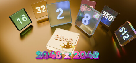
2048x2048 scored 68/100 on Steam Analyzer — Solid for a Casual capsule. Top priority fix: [uniqueness_polish] Introduce a distinctive visual style or mascot character to the design—such as an iconic numbered creature or branded game piece—to differentiate from generic puzzle game capsules.

Capsule scores by dimension

  • Genre Clarity: 8/10 — Number puzzle gameplay immediately clear. Numbered tiles with puzzle box aesthetic instantly communicate a casual number-matching game, with the prominent '2048 x 2048' text reinforcing the core mechanic. At tiny size, the stacked numbered cubes remain recognizable as puzzle elements, though the exact genre could momentarily be ambiguous without the title.
  • Title Readability: 7/10 — Bold title with minor legibility issues at tiny. The large '2048 x 2048' text in bright magenta and cyan stands out against the golden background with decent contrast. At tiny size the text remains somewhat readable but the thin gradient effect and color separation become softer, reducing sharpness slightly.
  • Contrast & Color: 7/10 — Warm gold base with bright accent highlights. The warm golden-tan background provides clear separation from the cool blue and magenta text of the title, and the numbered tiles have distinct value differences with shadows creating depth. At tiny size, the overall read remains clear due to strong light-to-dark relationships, though some mid-tone tiles blend slightly into the background.
  • Uniqueness & Polish: 6/10 — Competent 3D render without distinctive hook. The 3D-rendered numbered cubes and crown emblem show technical competence but follow a fairly standard presentation of the 2048 concept without a memorable visual twist or art style signature. The design is clean and functional but does not convey a unique selling point beyond the core mechanic, making it blend with other puzzle game capsules at genre level.
  • Brand Consistency: 6/10 — Simple visual identity with minimal signature. The golden palette and 3D cube aesthetic are consistent within the capsule, and the crown symbol hints at achievement or victory, but there are no strong iconic motifs or palette markers that would make this recognizable across different marketing materials. Internal cohesion is present but brand recognition potential is limited.
  • Composition: 7/10 — Clear focal hierarchy with slight clutter risk. The numbered tiles arranged in a fanned semi-circle create a natural focal point with the crown and title anchoring the center-bottom, establishing clear visual hierarchy. At small size the composition reads well, though the scattered tile arrangement could feel slightly cluttered if further compressed; safe margins are adequate but the tiles approach the edges.

What works

  • Instant genre communication. Numbered cube tiles immediately signal a math or puzzle game without ambiguity, supported by the explicit '2048' title reinforcement.
  • Strong color separation. Warm golden background contrasts effectively against cool blue and magenta title text, maintaining readability even at small sizes.
  • Organized visual layout. The fanned tile arrangement and centered title create natural visual flow that guides the eye without overwhelming the composition.

What hurts the capsule

  • Generic 3D aesthetic. The rendered tiles lack a distinctive art style or visual hook that would set this capsule apart from competing puzzle games in a crowded casual space.
  • Weak brand identity signals. No iconic character, logo, or signature visual motif exists that would make this game recognizable in future marketing or alongside other game titles.
  • Title gradient softness at small scale. The cyan-magenta gradient effect on the '2048 x 2048' text loses definition and sharpness when the capsule is viewed at tiny thumbnail size, compromising legibility impact.

Priority fixes

  1. [uniqueness_polish] Introduce a distinctive visual style or mascot character to the design—such as an iconic numbered creature or branded game piece—to differentiate from generic puzzle game capsules.
  2. [title_readability] Add a subtle dark outline or solid backdrop layer to the '2048 x 2048' title text to strengthen contrast and maintain legibility at tiny sizes without relying on gradient effects.
  3. [brand_consistency] Develop a signature color palette or recurring visual motif (such as a unique tile texture, iconic symbol, or character) that can be reused across store banners and screenshots for stronger brand recall.

Store copy priority fixes

  1. [uniqueness] Add a paragraph explaining what differentiates this 2048 implementation—custom art style, exclusive game modes, leaderboard features, or any variation from the classic game that justifies a download.
  2. [hook_strength] Rewrite the short description to lead with an emotional or curiosity hook, such as 'Test your strategy as random tiles force tough decisions' or 'Can you reach 2048 before the board locks?' instead of the passive 'Join the numbers.'
  3. [feature_communication] Consolidate the bullet points to eliminate repetition and add information about what happens after reaching 2048, whether there are endless modes, difficulty levels, or other progression incentives.
  4. [audience_targeting] Add a sentence explicitly positioning the game—e.g., 'Perfect for quick puzzle breaks' or 'A relaxing brain-teaser for all ages'—to help players self-identify as the intended audience.

Related guides

Steam app ID: 3776220 · Tags: Casual, Puzzle, Puzzle Platformer, 3D, Family Friendly