Scoring genre clarity...
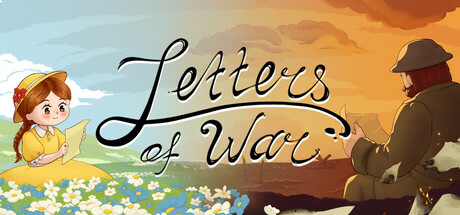
Letters of War is an adventure war drama inspired by real events and a spiritual successor to the legendary Valiant Hearts: The Great War. Help a simple British carpenter not lose touch with his little daughter during World War II. Connect their destinies with the help of letters.
$7.99Positive(16)
AdventureWarCute
Wood Cabin GamesSep 25, 2025