Scoring genre clarity...
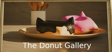
The showcase of student donuts and other 3d models from their stemmersion class. Walk through an art gallery filled with their donut renders from the blender donut tutorial and other 3d models inspired by the other half of their stemmersion... fencing! Come back every year to see an updated museum
Free to PlayPositive(15)
CasualDesign & IllustrationWalking Simulator
DRSSJul 4, 2025