Quick text summary
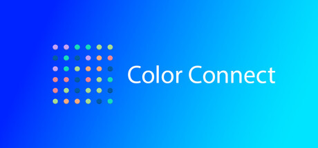
Color Connect scored 70/100 on Steam Analyzer — Good for a Casual capsule. Top priority fix: [uniqueness_polish] Add a distinctive visual hook such as a stylized character, animated gameplay element, or signature art style that communicates core mechanic personality beyond a simple dot grid.
Capsule scores by dimension
- Genre Clarity: 7/10 — Puzzle game signaled clearly. The grid of colorful dots immediately communicates a casual puzzle game mechanic. The dot pattern and connection theme are readable at full size and remain recognizable at small size, though at tiny size the dots may blur slightly into visual noise rather than distinct gameplay elements. The color variety supports puzzle game expectation without confusion.
- Title Readability: 8/10 — Title clear at all sizes. The 'Color Connect' text is clean, sans-serif, and positioned against a solid gradient background with no competing texture. It maintains excellent legibility at small and tiny sizes due to large letterforms and strong white-on-blue contrast. The text placement to the right of the dot grid avoids overlap and ensures reliable readability across all viewing scales.
- Contrast & Color: 8/10 — Strong separation and pop. The blue-to-cyan gradient background provides excellent value separation from the multicolored dots and white title text. The dots use warm and cool tones that read distinctly even at tiny size, and the overall design pops against the #1b2838 Steam dark background. In grayscale, the dots maintain clear silhouette separation from the background gradient, supporting quick recognition.
- Uniqueness & Polish: 6/10 — Functional but generic execution. The capsule is clean and competently designed with a simple dot grid and gradient background, but it lacks distinctive visual hooks or premium craft that would set it apart in the casual puzzle space. The design communicates the core mechanic effectively without stylistic flourishes, memorable character work, or a unique visual signature that hints at gameplay depth or personality. Compared to top-performing genre peers like Balatro or Tiny Glade, it feels more template-adjacent than inspired.
- Brand Consistency: 6/10 — Consistent but unremarkable branding. The internal design is cohesive—gradient background, dot grid, clean typography—with a consistent color palette and rendering style. However, there are no distinctive brand identity cues such as iconic characters, signature motifs, or a memorable visual trademark that could be recognized independently. The design is internally stable but offers no memorable brand signal beyond the title text.
- Composition: 7/10 — Balanced layout with clear focal points. The dot grid on the left and title on the right create a natural left-to-right reading flow with good visual balance and no wasted space. At small and tiny sizes, the dots function as a cohesive focal point while the title anchors the secondary focus. The gradient background extends safely across edges, and key elements avoid unsafe margins, though the dot grid pattern may lose individual clarity at very tiny sizes due to scale compression.
What works
- Title legibility across scales. Clean sans-serif font with excellent contrast and positioning ensures 'Color Connect' remains readable at tiny size without any obscuring textures.
- Gradient background effectiveness. The blue-to-cyan gradient provides strong value separation from all foreground elements and pops clearly against Steam's dark background.
- Balanced composition. Dot grid and title positioning create natural visual flow with no overlapping elements or compositional clutter.
What hurts the capsule
- Generic puzzle game presentation. The dot grid concept lacks distinctive style, personality, or visual storytelling that would differentiate it from other casual puzzle game capsules.
- No memorable brand identity. The design contains no iconic character, signature motif, or visual trademark that would make the brand recognizable in isolation.
- Dot pattern clarity at tiny size. At very small scales, individual dots may blur together into a solid shape, reducing the clarity of the grid mechanic at quick-scroll speeds.
Priority fixes
- [uniqueness_polish] Add a distinctive visual hook such as a stylized character, animated gameplay element, or signature art style that communicates core mechanic personality beyond a simple dot grid.
- [genre_clarity] Introduce a subtle gameplay hint such as connected lines between same-colored dots or a score multiplier visual to reinforce the connection mechanic at tiny size.
- [brand_consistency] Develop a signature color palette or motif (e.g., recurring shape, icon, or character) that becomes visually associated with Color Connect across all marketing materials.
Store copy priority fixes
- [hook_strength] Replace the generic "fun puzzle game" opener with a specific hook that captures what makes Color Connect unique—e.g., 'Chain explosive color combos in fast-paced roguelite runs' or focus on the roguelite aspect if that is the differentiator.
- [uniqueness] Add 1–2 sentences explaining what makes Color Connect different from other color-match puzzlers; if roguelite mechanics are core, describe how runs/progression works and why it matters.
- [feature_communication] Add a sentence clarifying progression mechanics: How do players advance between matches? Are there unlocks, daily challenges, or a progression system that justifies repeated play?
- [audience_targeting] Add a sentence signaling session length and intensity—e.g., 'perfect for quick 5-minute plays' or 'endless mode for long sessions'—to help the right player self-identify.
Related guides
Steam app ID: 3779810 · Tags: Casual, Arcade, Puzzle, Roguelite, 2D