Scoring genre clarity...
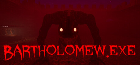
In this short FPS horror experience you are thrown into a maze where the game's state shifts between Nightmare and Dream, you are hunted by the monster Bartholomew in the nightmare and you get to hunt him in the dream. Upgrade your revolver, stock up on traps and kill Bartholomew.
Free to PlayPositive(39)
Arena ShooterActionPvE
BrickLayer StudiosJul 22, 2025