Scoring genre clarity...

Elven Rivers 5: UnderSea capsule

Elven Rivers 5: UnderSea

Explore the boundless ocean, uncover hidden treasures, and befriend two powerful princes of the underwater kingdom!

$14.99
StrategyAdventureCasual
8floor ltd Jul 25, 2025

Elven Rivers 5: UnderSea scores 70/100 — better than 28% of Strategy capsules (n=5,103).

$14.99 · Released Jul 25, 2025 · By 8floor ltd

Quick text summary

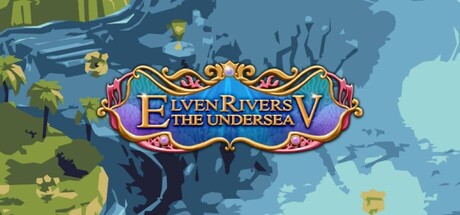
Elven Rivers 5: UnderSea scored 70/100 on Steam Analyzer — Good for a Strategy capsule. Top priority fix: [uniqueness_polish] Replace generic scattered fish with a distinctive character or two underwater princes mentioned in the game description to establish memorable brand identity

Capsule scores by dimension

  • Genre Clarity: 7/10 — Casual adventure with underwater setting. The underwater kingdom theme is immediately readable from the blue water backdrop, stylized ocean elements (seaweed, fish silhouettes), and the ornate title treatment that suggests fantasy adventure. At TINY size, the water gradient and ocean motifs still communicate 'underwater exploration' effectively, though the specific casual/strategy blend is less apparent without text. The visual style aligns with match-3 or casual adventure genre expectations.
  • Title Readability: 8/10 — Clear ornate logo, strong contrast. The 'ELVEN RIVERS 5: THE UNDERSEA' title uses a bold ornate serif font with gold/yellow stroke against the blue background, creating strong value separation. At SMALL size (231x87), the logo remains legible with the decorative flourishes intact. At TINY size (120x45), the core text is still readable though fine details of the ornamental border elements soften slightly, but the title does not collapse.
  • Contrast & Color: 8/10 — Strong blue-gold contrast hierarchy. The gold/yellow ornate title and decorative elements create strong warm-cool contrast against the cool blue water gradient background. The yellow fish accents in the upper left and foreground add focal warmth and pop against the blue midtones. In grayscale, the value separation between the title (light) and background (mid-tone blue) remains clear and readable at all sizes.
  • Uniqueness & Polish: 6/10 — Competent fantasy theming, generic composition. The ornate logo treatment and underwater setting show craft and intentional design, with the decorative border and gold accents suggesting premium casual game presentation. However, the composition—layered water background with scattered fish and foliage—feels like a standard fantasy adventure template without a distinctive visual hook or unique selling point. The art style is polished but not memorable or distinctive versus peers like DAVE THE DIVER or Snufkin.
  • Brand Consistency: 6/10 — Consistent ornate style, limited identity. The ornate red-gold logo treatment and cool blue underwater palette appear coherent and likely consistent across store assets. However, there are no iconic character, motif, or signature visual elements that would make this capsule instantly recognizable on its own—the style is derivative of fantasy adventure branding conventions without a memorable identity hook like the peers listed above.
  • Composition: 7/10 — Clear focal point, layered background. The ornate title is centered as the primary focal point with good visual weight, supported by a layered underwater background (dark silhouette shapes, light water, yellow fish accents). The composition uses depth effectively and avoids clutter. At SMALL and TINY sizes, the hierarchy holds and the eye is drawn to the title first, though some of the background foliage detail on the left edge becomes muddy at reduced sizes but does not harm readability.

What works

  • Ornate title contrast. Gold and red decorative logo against cool blue background creates strong warm-cool separation that pops at all viewing sizes.
  • Clear underwater theme. Water gradient, fish silhouettes, and seaweed establish genre and setting instantly, communicating 'casual ocean adventure' to casual browsers.
  • Readable logo at small size. The ornate serif treatment maintains legibility even at 120x45 pixel TINY size without critical collapse of letterforms.

What hurts the capsule

  • Generic template composition. Scattered fish and background foliage feel like standard fantasy asset placement rather than a distinctive visual hook that differentiates from competitors.
  • No character or iconic motif. Unlike top performers (DAVE THE DIVER, Snufkin, Harold Halibut), there is no recognizable character, mascot, or signature symbol to anchor brand recall.
  • Muddy left edge detail. Foliage silhouettes on the left side become indistinct at SMALL size, creating visual noise rather than supporting composition.

Priority fixes

  1. [uniqueness_polish] Replace generic scattered fish with a distinctive character or two underwater princes mentioned in the game description to establish memorable brand identity
  2. [composition] Simplify or strengthen the left-side foliage silhouettes so they either become graphic weight anchors or fade to pure background, eliminating muddy detail distraction
  3. [brand_consistency] Establish a signature color accent or character motif from game assets that can appear consistently across future store pages and marketing to build recognition

Store copy priority fixes

  1. [feature_communication] Rewrite the bullet points to describe actual gameplay actions: 'Solve environmental puzzles to navigate the Undersea,' 'Manage relationships through dialogue choices to gain allies,' 'Survive timed encounters against monsters and royal intrigue' — to clarify what the strategy and time management tags mean in practice.
  2. [uniqueness] Add a sentence after the opening narrative that anchors the game's identity: 'As the fifth chapter of the Elven Rivers saga, this installment expands the adventure with new underwater mechanics and a deeper focus on NPC relationships.'
  3. [genre_clarity] Explicitly state the core gameplay loop early in the detailed description or in the bullet section: e.g., 'Unravel mysteries through real-time tactical decisions and puzzle-solving while building alliances.'
  4. [audience_targeting] Add a sentence clarifying the intended player: 'Perfect for players who love story-driven adventures with relaxed pacing and character-focused gameplay.'

Related guides

  • Steam page optimisationCapsule, copy, screenshots, tags — the full Steam page conversion stack.
  • Steam tags guideTag selection, ordering, and how it shapes Steam's recommendation rails.

Steam app ID: 3784100 · Tags: Strategy, Adventure, Casual, Arcade, Puzzle