Scoring genre clarity...
Scoring genre clarity...
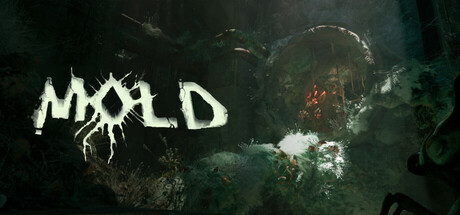
MOLD scores 72/100 — better than 42% of Casual capsules (n=10,512).
Mostly Positive (97 reviews) · Free to Play · Released Jul 15, 2025 · By Finley Southwick
MOLD scored 72/100 on Steam Analyzer — Good for a Casual capsule. Top priority fix: [genre_clarity] Add a visible insect silhouette or bug form in the composition to immediately communicate the player role and scale of exploration.
Steam app ID: 3785750 · Tags: Casual, Simulation, Puzzle, Walking Simulator, Collectathon