Scoring genre clarity...
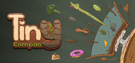
In Tiny Company you run a cozy little shop where you design custom terrariums for tiny clients.Have a chat with quirky critters, learn their personalities, follow their oddly instructions, and design the home of their dreams.
$4.991 user reviews
Immersive SimSandboxVisual Novel
FoxByteOct 24, 2025