Scoring genre clarity...

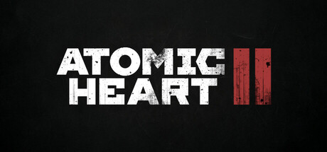
Atomic Heart 2 capsule

Atomic Heart 2

The Atomic Heart sequel brings you back to the retrofuturistic universe, full of new characters and dangers. The game immerses you in events on a global scale and raises the bar for what an open-world action RPG can do.

AdventureActionRPG
MundfishTo be announced

Atomic Heart 2 scores 77/100 — better than 83% of Adventure capsules (n=8,231).

Released To be announced · By Mundfish

Quick text summary

Atomic Heart 2 scored 77/100 on Steam Analyzer — Good for a Adventure capsule. Top priority fix: [genre_clarity] Integrate a character silhouette or environmental element (retrofuturistic robot, sci-fi weapon, or signature Atomic Heart visual motif) to clarify action-RPG gameplay and franchise storytelling at small size.

Capsule scores by dimension

  • Genre Clarity: 7/10 — Retrofuturistic action implied. The bold sans-serif typography and stark red geometric icon on black background evoke a sci-fi aesthetic consistent with Atomic Heart's retrofuturistic setting. At tiny size, the red symbol reads as a stylized tech element, though genre specificity (action RPG vs. pure action) remains somewhat ambiguous without additional UI or character cues. The minimalist approach prioritizes brand recognition over gameplay clarity.
  • Title Readability: 8/10 — Clean, bold, highly legible. The white sans-serif title 'ATOMIC HEART' is crisp and maintains excellent readability across all sizes from full header to tiny thumbnail, with strong contrast against the dark background and clean letter spacing. The red icon sits to the right without competing for attention. At tiny size, the lettering remains distinctly readable, though the Roman numeral 'II' icon is abstract enough that context is required to recognize it as a sequel indicator.
  • Contrast & Color: 8/10 — Strong value separation. The white title and red geometric icon create excellent contrast against the near-black background (#1b2838), with clear silhouette separation in both color and grayscale. The red icon's weathered texture adds visual interest while maintaining legibility. In a quick scroll or squint test, both elements separate cleanly without muddy mid-tones or blending.
  • Uniqueness & Polish: 7/10 — Polished minimalism, limited narrative. The capsule demonstrates clean craft with intentional typography and a distinctive retrofuturistic aesthetic consistent with the Atomic Heart IP, but relies entirely on text and a geometric icon rather than visual storytelling or character/environment that hints at gameplay innovation. Compared to top-tier genre peers like Black Myth: Wukong or Armored Core VI that showcase character silhouettes or thematic iconography, this feels more like a branded text treatment than a unique visual hook.
  • Brand Consistency: 8/10 — Strong Atomic Heart brand DNA. The retrofuturistic typography, red and white color palette, and minimalist geometric icon align strongly with the established Atomic Heart visual identity and the franchises' sleek Soviet-inspired aesthetic. The Roman numeral 'II' reinforces sequel positioning. Internal cohesion is high and the design would be immediately recognizable to fans of the first game, though without character or environmental elements visible on this capsule alone.
  • Composition: 8/10 — Balanced, safe, centered hierarchy. The title is centered horizontally with the red icon anchored to the right, creating a balanced composition that respects safe margins and avoids edge-hugging or cropping issues at any size. The focal point is clear and uncluttered. The substantial black background provides breathing room, though at tiny size the icon becomes quite abstract and the title occupies most readable real estate.

What works

  • Excellent title legibility. Bold white sans-serif maintains sharp readability from full to tiny sizes with no letterform collapse or outline issues.
  • Strong contrast and silhouette. Red icon and white title separate cleanly against dark background in both color and grayscale, supporting quick recognition during scroll.
  • Polished brand consistency. Retrofuturistic aesthetic, color palette, and geometric language align cohesively with Atomic Heart franchise identity.
  • Safe, balanced layout. Centered composition with breathing room avoids cropping issues and creates stable visual hierarchy across all sizes.

What hurts the capsule

  • Abstract icon lacks clarity. The red geometric 'II' symbol is visually interesting but doesn't clearly communicate 'sequel' or establish genre context without prior franchise knowledge.
  • Minimal gameplay storytelling. Capsule relies entirely on typography and abstract branding rather than character, environment, or mechanical cues that communicate action RPG gameplay or franchise uniqueness.
  • Generic minimalism template feel. While polished, the text-only approach and centered layout lack the visual narrative depth or distinctive art hook seen in top-tier peers like Black Myth: Wukong or Armored Core VI.

Priority fixes

  1. [genre_clarity] Integrate a character silhouette or environmental element (retrofuturistic robot, sci-fi weapon, or signature Atomic Heart visual motif) to clarify action-RPG gameplay and franchise storytelling at small size.
  2. [uniqueness_polish] Layer a subtle background asset or color gradient that hints at the retrofuturistic world and core gameplay loop rather than relying on text alone for visual differentiation.
  3. [composition] Consider secondary supporting imagery (secondary character, weapon, or environment detail) in lower third to create depth layers and visual storytelling without compromising title readability.

Store copy priority fixes

  1. [hook_strength] Rewrite the short description to lead with the dual-hand combat/glove ability system or a specific high-stakes scenario rather than 'The Atomic Heart sequel brings you back'; make the first sentence answer 'why should I care about this right now?'
  2. [feature_communication] Add a concrete example of combat or exploration in the detailed description: e.g., 'Use glove abilities to freeze enemies, then switch to a flamethrower for maximum impact' or 'Explore sprawling Soviet-inspired mega-cities where every location holds new dangers and story clues.'
  3. [uniqueness] Insert a direct statement of what sets this sequel apart: e.g., 'The expanded RPG system now includes [specific mechanic], while the re-engineered combat allows simultaneous ability and weapon use—a first for the series' or compare to other open-world action RPGs in a way that explains this game's distinct value.
  4. [audience_targeting] Explicitly state which player type should buy: 'For fans of story-rich action RPGs with deep character customization' or 'If you loved the first Atomic Heart's blend of narrative and moment-to-moment combat, the sequel deepens both.'

Related guides

Steam app ID: 3788800 · Tags: Adventure, Action, RPG, Shooter, Action-Adventure