The Asterion scores 72/100 — better than 46% of Action capsules (n=8,534).

Quick text summary

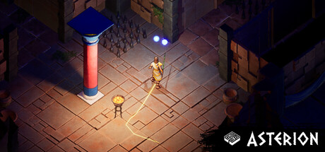
The Asterion scored 72/100 on Steam Analyzer — Good for a Action capsule. Top priority fix: [genre_clarity] Emphasize the Minotaur or a distinctive mythological element (horn silhouette, specific creature) to strengthen Greek mythology signaling and differentiation.

Capsule scores by dimension

  • Genre Clarity: 8/10 — Isometric roguelike adventure clear. The isometric perspective, torch-lit dungeon environment, and small humanoid character figures immediately signal a dungeon-crawler or roguelike adventure. The brick floor, architectural geometry, and mythological aesthetic align with Greek mythology context. At tiny size, the silhouettes and warm orange lighting still read as an indoor fantasy exploration game, though specific Greek mythology details fade.
  • Title Readability: 7/10 — Logo readable, minimal treatment. The ASTERION logo in white text with a small square icon sits in the bottom right, maintaining strong contrast against the dark dungeon background. At small size it remains legible, though the small icon detail softens slightly. At tiny size the text is still readable but requires focus; the bottom-right placement avoids competing with the scene focal point.
  • Contrast & Color: 8/10 — Warm lighting pops cleanly. The warm orange and golden torch lighting creates strong value separation from the cool dark blues and purples of the dungeon walls and background. The illuminated floor and character figures read clearly against deep shadows. In grayscale, the mid-tone floor and bright accents maintain good silhouette clarity even at tiny sizes, with the white logo adding final pop.
  • Uniqueness & Polish: 7/10 — Stylized isometric, competent craft. The art direction shows a deliberately stylized, hand-painted aesthetic with intentional lighting and isometric composition that feels cohesive and premium. The scene communicates exploration and mystery rather than generic dungeon template. However, the visual hook feels somewhat familiar to other indie roguelikes and mythological games; while polished, it does not immediately stand apart from peers like Hades or Sea of Stars in the genre landscape.
  • Brand Consistency: 6/10 — Cohesive style, no iconic motif. The capsule maintains internal consistency with warm isometric lighting, muted earth tones, and a clear art direction that likely extends to the game itself. However, there are no memorable iconic symbols, signature character designs, or distinctive visual motifs that would allow instant recognition on repeat exposure. The presentation is competent but generic enough that it does not create a strong brand anchor.
  • Composition: 7/10 — Clear focal point, safe layout. The two small golden figures occupy the center-left of the frame, creating a primary focal point that draws the eye immediately. The torch pillar on the left and architectural elements frame the scene without overwhelming the composition. Logo placement bottom-right avoids overlap with the action. At small size, the hierarchy remains clean; at tiny size, the composition holds but individual character details blur into silhouette.

What works

  • Strong isometric visual language. The dungeon environment and camera angle immediately communicate a roguelike exploration game with clear environmental storytelling.
  • Effective contrast and lighting. Warm orange torchlight stands out sharply against cool dark backgrounds, maintaining readability and visual appeal at all sizes down to tiny.
  • Clean logo placement. The ASTERION logo sits in a safe bottom-right region with strong white-on-dark contrast and does not interfere with the main scene composition.

What hurts the capsule

  • Generic mythology aesthetic. While polished, the scene lacks a distinctive visual hook that separates it from other indie isometric roguelikes and mythological games in the space.
  • No iconic character or symbol. The generic humanoid figures and dungeon setting do not establish a memorable brand identity or instantly recognizable motif for future marketing.
  • Character detail loss at tiny scale. The two figures collapse into small silhouettes at thumbnail size, losing any expression or unique design that might make them memorable.

Priority fixes

  1. [genre_clarity] Emphasize the Minotaur or a distinctive mythological element (horn silhouette, specific creature) to strengthen Greek mythology signaling and differentiation.
  2. [uniqueness_polish] Introduce a signature visual motif or color accent (e.g., glowing sigil, golden rope, distinctive weapon) that creates instant brand recognition across marketing materials.
  3. [brand_consistency] Ensure the most prominent character or central object has a recognizable iconic design that can anchor the brand identity and appear in trailers, social media, and store pages.

Store copy priority fixes

  1. [feature_communication] Explain the artifact system with one concrete example: 'Equip mythical artifacts like Ares' Rage (boost attack power) or Icarus' Wings (gain mobility)' to show mechanical function.
  2. [audience_targeting] Add a sentence about difficulty and accessibility: 'Designed for both narrative explorers and roguelike veterans—adjust challenge to your pace' to align with Casual tag and 'Playable without Timed Input' category.
  3. [uniqueness] Replace 'Game of Choice and Consequence' section with a specific differentiator: 'Unlike procedural roguelikes, your choices unlock permanent story variations, ensuring no two playthroughs tell the same myth.'

Related guides

Steam app ID: 3790990 · Tags: Action, Casual, Strategy, Action-Adventure, Roguelike