Scoring genre clarity...

Tekkout2 - Balls Of Rust capsule

Tekkout2 - Balls Of Rust

Play through challenging levels in eight atmospheric worlds in this rusty and technically demanding Breakout remake. Collect and craft crystals to upgrade your equipment and find your own way through the level jungle.

$0.993 user reviews
ActionCasualArcade
TSSpieleJun 30, 2025

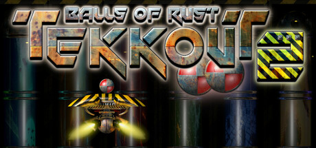
Tekkout2 - Balls Of Rust scores 62/100 — better than 3% of Action capsules (n=8,534).

3 user reviews · $0.99 · Released Jun 30, 2025 · By TSSpiele

Quick text summary

Tekkout2 - Balls Of Rust scored 62/100 on Steam Analyzer — Solid for a Action capsule. Top priority fix: [title_readability] Simplify the title font to a bold, sans-serif style with thicker strokes and increase letter spacing to maintain legibility at tiny capsule size; test collapse at 120x45 pixels.

Capsule scores by dimension

  • Genre Clarity: 7/10 — Action arcade breakout clearly signaled. The paddle, ball, and brick-breaking visual language are instantly recognizable as a Breakout/Arkanoid-style game at full size. The rusty industrial aesthetic with metallic textures and warning stripes establishes tone, though at tiny size the genre reads primarily through the paddle silhouette and ball, losing some of the crafting/upgrade depth mentioned in the description. The action-arcade intent is clear but casual/indie nuance requires prior knowledge.
  • Title Readability: 6/10 — Title legible at full size only. The chrome/metallic serif font on 'TEKKOUT' is readable at full header size with strong outline definition, but the stacked layout and decorative treatment cause noticeable degradation at small capsule size. At tiny thumbnail size, 'TEKKOUT' becomes blurry and 'BALLS OF RUST' drops below legible threshold, relying on prior knowledge rather than instant recognition. The subtitle tagline is unreadable at reduced scales, reducing discoverability.
  • Contrast & Color: 7/10 — Strong warm-cool separation reads well. The orange and gold metallic title and brick elements contrast effectively against the dark teal/blue machinery background, with the yellow-black hazard stripe in top right adding bright punctuation. At small size, the warm title still pops against the cool background, and the grayscale silhouette of the paddle at bottom center reads clearly. The mid-tone machinery textures risk muddiness on quick scroll, but primary elements (title, paddle, ball) maintain sufficient value separation.
  • Uniqueness & Polish: 6/10 — Competent industrial style, generic layout. The rusty metal aesthetic and industrial theming show intentional art direction that fits the 'Balls of Rust' concept well, with visible brushed steel, rivets, and grime textures. However, the composition follows a standard centered-text-over-background formula common in indie action games, and the visual hook does not strongly communicate the upgrade/crafting or atmospheric world progression mentioned in the description. The craft is solid but the standout idea is modest.
  • Brand Consistency: 5/10 — Rusty industrial theme clear, limited identity. The corroded metallic palette, warning stripe motif, and mechanical paddle are internally cohesive and reinforce the 'rust' concept consistently. However, there are no iconic characters, signature symbols, or memorable visual hooks that would create long-term brand recall independent of the title text. The aesthetic is competent and thematic but generic enough that a player returning to the store would need the title to recognize it as the same game.
  • Composition: 6/10 — Centered hierarchy, safe but static. The title dominates the upper-center zone with the paddle and ball fixtures positioned below in a traditional vertical stack, creating a clear focal point at full size. At small and tiny sizes, the composition collapses slightly as the title becomes the only readable element and supporting details blur together, reducing the sense of depth and multiple worlds promised by the description. The safe centered approach works but does not leverage the canvas dynamically; important elements like the paddle are positioned too close to bottom edge and risk cropping on some Steam layouts.

What works

  • Warm-cool color contrast. Orange metallic title and gold accents pop effectively against the dark teal machinery background, maintaining readability at small sizes.
  • Thematic visual consistency. Rusty metal textures, corroded rivets, warning stripes, and industrial palette align cohesively with the 'Balls of Rust' concept.
  • Clear genre iconography. Paddle and ball silhouettes immediately signal a Breakout-style action game even at reduced scale.

What hurts the capsule

  • Title degradation at small size. Chrome serif font and stacked layout become blurry and illegible at tiny thumbnail scale, harming storefront discoverability.
  • Generic composition. Centered text-over-background layout lacks visual dynamism and does not communicate the upgrade/crafting or eight-world progression unique to the game.
  • Limited brand recognition hook. No iconic character, mascot, or signature symbol creates memorable identity; the title text is essential for recognition.
  • Cramped bottom element placement. The paddle fixture sits too close to the bottom edge and risks being cut or obscured by Steam UI cropping on capsule layouts.

Priority fixes

  1. [title_readability] Simplify the title font to a bold, sans-serif style with thicker strokes and increase letter spacing to maintain legibility at tiny capsule size; test collapse at 120x45 pixels.
  2. [composition] Reposition the paddle and ball elements into the mid-canvas zone and add a glowing aura or subtle motion trail to create visual interest and depth layering that survives the small size reduction.
  3. [genre_clarity] Add a subtle crystal or upgrade icon as a visual motif in the top corner to hint at the crafting mechanic and differentiate from generic Breakout clones.
  4. [uniqueness_polish] Incorporate one of the eight atmospheric worlds (e.g., a tinted background layer or thematic asset) to hint at world progression and visual variety rather than generic industrial setting alone.

Store copy priority fixes

  1. [hook_strength] Rewrite the short description to lead with a specific, exciting outcome—e.g., 'Smash through eight wild worlds in this Breakout-style arcade game with a crafting system that lets you forge custom power-ups and dominate the leaderboards.' This removes vague 'technically demanding' language and adds urgency.
  2. [feature_communication] Add a concrete example of the upgrade path in the detailed description—e.g., 'Collect crystals to craft ball accelerators, paddle extensions, or special bounces that unlock new strategies in each level.' This shows rather than tells what upgrades do.
  3. [audience_targeting] Insert a difficulty/accessibility statement early—e.g., 'Whether you're a speedrunner chasing high scores or a casual player enjoying atmospheric puzzle-solving, Tekkout2 scales to your skill level.' This reconciles Casual tag with 'technically demanding' language.
  4. [uniqueness] Add a differentiator after the Breakout explanation—e.g., 'Unlike classic Breakout, your equipment choices and crafted gems fundamentally reshape how you approach each level, letting you find your own path through the obstacle jungle.' This articulates why this specific game matters.

Related guides

Steam app ID: 3792430 · Tags: Action, Casual, Arcade, Shoot 'Em Up, 2D