Scoring genre clarity...
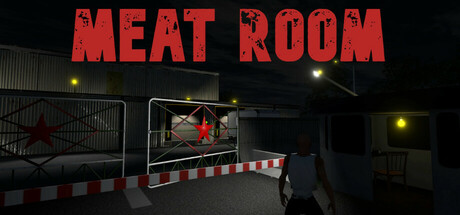
Meat Room is a first-person horror survival game set in 1980s Eastern Europe. You play as Dimitry, a night shift worker at a meat packing facility. At first, everything seems normal—just another night on the job. But soon, strange things begin to happen. Something’s wrong in the Meat Room.
$1.999 user reviews
First-PersonCasualHorror
NIGHTMARE FLOWERNov 14, 2025