Scoring genre clarity...

77p egg: Cubicle 77 capsule

77p egg: Cubicle 77

You are trapped in the endless toilet dimension or something. Observe your surroundings carefully to get back to your wife and finish your lunch.

$1.99Positive(15)
Hidden ObjectCasualParody
77p StudiosApr 24, 2026

77p egg: Cubicle 77 scores 62/100 — better than 5% of Hidden Object capsules (n=1,334).

Positive (15 reviews) · $1.99 · Released Apr 24, 2026 · By 77p Studios

Quick text summary

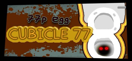
77p egg: Cubicle 77 scored 62/100 on Steam Analyzer — Solid for a Hidden Object capsule. Top priority fix: [title_readability] Remove or integrate the '77p egg' tagline into the main title treatment to eliminate unreadable micro-text at tiny size.

Capsule scores by dimension

  • Genre Clarity: 7/10 — Quirky adventure with puzzle hints. The toilet imagery and confined space aesthetic clearly signal a surreal, offbeat adventure or puzzle game rather than action or combat-focused title. At tiny size, the prominent toilet silhouette with glowing red eyes reads as the core visual hook and communicates oddball humor. The brown textured background and industrial aesthetic support a confined, absurdist exploration game vibe that matches the description of being trapped in a dimension.
  • Title Readability: 5/10 — Mixed legibility across sizes. The main 'CUBICLE 77' text uses a bold yellow outline font that reads clearly at full and small sizes due to high contrast against brown background. However, at tiny size the text compresses and the outline thickness becomes proportionally less effective, risking collapse. The small '77p egg' tagline above is unreadable at tiny sizes and adds visual noise without conveying essential information.
  • Contrast & Color: 7/10 — Strong warm-cool separation. The warm rust-brown background with blue-gray sky creates distinct value separation from the white toilet and golden yellow title text, which pop clearly against the dark Steam background. The red-eyed toilet provides a focal contrast point. At tiny size, the silhouette of the toilet maintains good separation, though the brown texture detail becomes noise and reduces overall clarity when squinting.
  • Uniqueness & Polish: 6/10 — Quirky concept, competent execution. The absurdist premise of being trapped in a toilet dimension is memorable and communicates a unique hook that stands out from typical adventure games. The glowing red eyes add personality to the toilet character. However, the overall visual treatment feels somewhat straightforward—the composition and effects lack the polished craft or distinctive art direction seen in top-tier indie titles like DREDGE or DAVE THE DIVER, landing it in solid-but-not-exceptional territory.
  • Brand Consistency: 5/10 — Limited identity signals. The toilet with red eyes could serve as an iconic motif, but the capsule lacks secondary visual cues, signature color palette, or consistent art language that would build recognizable brand identity. The brown and blue background feels generic rather than distinctive to this game's universe. Without reference to the 7 store screenshots, there are no internal brand consistency signals that suggest this capsule would feel part of a cohesive visual identity.
  • Composition: 7/10 — Clear focal point, safe layout. The toilet is centered as the primary subject with the title text positioned in the left-center area, creating a balanced composition with clear hierarchy. The toilet remains readable at all sizes due to its white color and silhouette strength. The design respects safe margins and avoids edge-critical elements, though the brown texture background fills space without adding depth or layering that would enhance visual interest.

What works

  • Bold yellow title contrast. The outlined 'CUBICLE 77' text stands out distinctly against the brown background and reads well at small and medium sizes.
  • Memorable toilet imagery. The toilet silhouette with red glowing eyes is quirky and distinctive enough to serve as a brand anchor for this absurdist adventure.
  • Centered focal point. The toilet is positioned as a clear primary subject that maintains readability and guides viewer attention across all viewing sizes.

What hurts the capsule

  • Unreadable tagline at scale. The small '77p egg' text above the title is illegible at tiny size and adds visual clutter without essential information.
  • Generic background texture. The brown rust texture and blue-gray sky feel formulaic and don't establish a distinctive visual identity unique to this game's surreal toilet dimension premise.
  • Limited depth and layering. The composition relies on flat background texture rather than atmospheric depth, reducing visual sophistication compared to benchmark titles.

Priority fixes

  1. [title_readability] Remove or integrate the '77p egg' tagline into the main title treatment to eliminate unreadable micro-text at tiny size.
  2. [uniqueness_polish] Add atmospheric depth through subtle background layering—silhouettes, lighting, or surreal elements—that reinforces the trapped-in-dimension concept.
  3. [brand_consistency] Develop a secondary visual motif or signature color accent beyond the toilet to create memorable brand recognition across marketing materials.

Store copy priority fixes

  1. [hook_strength] Remove 'or something' from the short description and rewrite as 'You are trapped in an endless toilet dimension. Observe your surroundings carefully to escape and finish your lunch.' to project confidence in the premise.
  2. [feature_communication] Add one concrete example of an abnormality in the detailed description (e.g., 'floating sinks, backwards stalls, walls breathing') to help players visualize the anomaly-hunting experience.
  3. [uniqueness] Explicitly state what this game does differently from The Exit 8 (e.g., 'a hilarious bathroom-focused twist on' or 'set in a parody mall toilet loop rather than') to clarify the differentiation rather than just naming the inspiration.

Related guides

Steam app ID: 3796740 · Tags: Hidden Object, Casual, Parody, Adventure, Comedy