Scoring genre clarity...
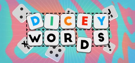
The wordy roguelike. Dicey Words is a clever dice-based word builder where you roll letters, reroll like Yahtzee, and craft five-letter words for big points. Earn powerful badges that twist the rules, boost your score, and transform each run into a strategic puzzle.
$4.99Positive(15)
CasualWord GameRoguelike
_TaralisAug 4, 2025