Scoring genre clarity...

BAD SECTOR ³ capsule

BAD SECTOR ³

The Cube summons you. A sentient structure of many floors where every mistake drags you farther from the exit. Detect the bad sectors, climb through the levels… and try to break the cycle.

$8.995 user reviews
IndieHorrorPsychological Horror
Studio GineNov 6, 2025

BAD SECTOR ³ scores 80/100 — better than 92% of Indie capsules (n=11,449).

5 user reviews · $8.99 · Released Nov 6, 2025 · By Studio Gine

Quick text summary

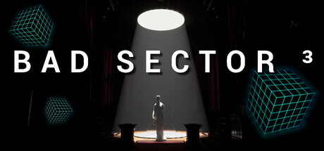
BAD SECTOR ³ scored 80/100 on Steam Analyzer — Good for a Indie capsule. Top priority fix: [genre_clarity] Enhance the figure's pose or add a subtle UI element hint (e.g., a scanline overlay, warning icon, or climbing gesture) to more clearly signal the roguelike puzzle-climbing core mechanic

Capsule scores by dimension

  • Genre Clarity: 7/10 — Sci-fi puzzle game established. The cyan wireframe cube motifs, stark laboratory lighting, and solitary figure silhouette against a harsh overhead light clearly communicate a sci-fi puzzle or exploration game. At tiny size, the geometric cube icons and high-contrast geometric shapes remain readable and suggest a cerebral, structured experience. However, the genre stops short of being immediately obvious as a roguelike-ish puzzle crawler without prior context.
  • Title Readability: 9/10 — Bold, clear, excellent hierarchy. BAD SECTOR 3 uses large, widely-spaced sans-serif capitals with strong white contrast against the dark background, making it fully legible at all sizes including tiny thumbnails. The title occupies prime real estate in the upper-left-to-center zone without fighting the focal point. At tiny size, the letters remain distinct and the spacing prevents blur collapse.
  • Contrast & Color: 8/10 — Strong value separation throughout. White title text and the figure's highlighted edges create sharp silhouettes against the deep black background, while cyan cube accents provide saturated accent color that pops without overwhelming. The warm amber floor lights below the figure add depth and visual interest. In grayscale, the value ladder from black to white to mid-gray is clean and reads well even at tiny size.
  • Uniqueness & Polish: 8/10 — Distinctive sci-fi puzzle aesthetic. The minimalist staging—a lone figure under interrogation-style overhead lighting with floating wireframe cubes—creates a memorable, intentional composition that feels premium and purposeful rather than generic. The cyan neon grid aesthetic paired with stark brutalism avoids template overlap with top-performing indie titles while maintaining visual clarity. The scene tells a story of confinement and mystery that aligns perfectly with the game's core loop described.
  • Brand Consistency: 8/10 — Coherent sci-fi identity established. The cyan wireframe cube is a signature motif repeated across the capsule, suggesting a recognizable identity symbol that likely carries through to in-game branding. The color palette (cyan, black, white, amber) and minimalist brutalist staging create internal cohesion and a distinctive visual language that could be recognized in future promotional materials. The aesthetic feels intentional and signature rather than borrowed.
  • Composition: 8/10 — Clear hierarchy, balanced depth. The composition uses layered depth effectively: background cubes (far), overhead light and figure (midground), and floor lights (foreground), guiding the eye naturally from top to bottom. The title sits safely in the upper third without edge-hugging risk, and the figure creates a strong vertical focal point. At small and tiny sizes, the composition remains readable with no clutter or scattered emphasis.

What works

  • Outstanding title clarity and placement. Large, widely-spaced capitals maintain perfect legibility at all sizes, from full header down to tiny thumbnail.
  • Distinctive sci-fi atmosphere. Minimalist staging with neon cyan cubes and harsh lighting creates a premium, intentional look that avoids generic indie template vibes.
  • Strong silhouette and value contrast. Deep blacks, bright whites, and saturated cyan accents create excellent separation that reads clearly in quick-scroll conditions and grayscale.
  • Effective layered composition. Foreground, midground, and background elements guide the eye naturally and create visual depth without clutter.

What hurts the capsule

  • Minimal narrative context at glance. While aesthetically strong, the capsule doesn't immediately communicate the roguelike, puzzle-climbing, or 'breaking the cycle' gameplay loop without prior knowledge.
  • Figure lacks distinctive silhouette. The central character is relatively generic and doesn't convey personality or unique design that would anchor brand identity on its own.

Priority fixes

  1. [genre_clarity] Enhance the figure's pose or add a subtle UI element hint (e.g., a scanline overlay, warning icon, or climbing gesture) to more clearly signal the roguelike puzzle-climbing core mechanic
  2. [brand_consistency] Ensure the cyan wireframe cube appears consistently across all store assets and in-game UI to strengthen the signature motif as a recognizable identity anchor

Store copy priority fixes

  1. [hook_strength] Rewrite the opening line to 'Detect hidden corruptions in a sentient Cube. Three mistakes and you're thrown back—with the architecture reshuffled. Can you escape before it traps you forever?' to lead with the core gameplay verb and raise immediate stakes.
  2. [feature_communication] Add 1–2 sentences after the short description explaining the detection mechanic: Is this hidden object hunting, logical puzzle-solving, or observation-based anomaly spotting? Make it tactile.
  3. [uniqueness] Insert a sentence comparing or contrasting this game's roguelite structure to common competitors: 'Unlike randomized roguelikes, every floor reshapes but retains solvable logic—your memory and skill matter more than luck.' or similar differentiator.
  4. [audience_targeting] Add a sentence identifying the target player: 'Made for puzzle fans who crave the tension of Dread X Collection but want mechanical depth over pure scares' or a comparable positioning statement.

Related guides

Steam app ID: 3798290 · Tags: Indie, Horror, Psychological Horror, Singleplayer, Puzzle