Scoring genre clarity...

Reytrieve Odyssey capsule

Reytrieve Odyssey

Reytrieve Odyssey is a vibrant 3D platformer starring a feisty android girl on a quest to retrieve mysterious data disks! Switch between powerful cartridges, explore giant colorful islands, and uncover the secrets of a broken world!

Adventure3D PlatformerCute
EgorPoskTo be announced

Reytrieve Odyssey scores 72/100 — better than 47% of Adventure capsules (n=8,231).

Released To be announced · By EgorPosk

Quick text summary

Reytrieve Odyssey scored 72/100 on Steam Analyzer — Good for a Adventure capsule. Top priority fix: [composition] Reduce background island detail or darken it further to create stronger silhouette separation of the character at TINY size, pushing secondary elements to clear support roles.

Capsule scores by dimension

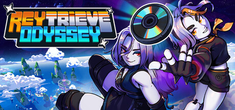
  • Genre Clarity: 8/10 — Colorful 3D platformer clearly signaled. The vibrant android protagonist, dynamic pose with extended arm, colorful floating islands in background, and bright cyan/purple/orange palette immediately read as a cheerful 3D platformer. At TINY size, the character silhouette and island scenery remain distinguishable, though genre specificity leans on color energy rather than explicit platformer iconography like platforms or collectibles.
  • Title Readability: 7/10 — Bold logo readable at all sizes. REYTRIEVE ODYSSEY uses a strong yellow-to-cyan gradient with thick letterforms and a black outline that separates cleanly from the purple-blue background. The title remains legible at SMALL size, though at TINY size (120x45) the outline slightly softens and secondary lettering (ODYSSEY) becomes harder to parse without prior context.
  • Contrast & Color: 8/10 — Strong saturation and value separation. Bright cyan, magenta, and orange character elements pop distinctly against the deep navy background. The glowing disc and character clothing create clear light-dark separation. In grayscale mental test, the character midtones and island cloudscape maintain reasonable separation, though the purple hair and dark space background compress slightly in value range at TINY size.
  • Uniqueness & Polish: 7/10 — Polished anime aesthetic, minor generic risk. The character design shows intentional style with distinct purple/white coloring, expressive pose, and thematic data-disc prop that hints at the retrieval mechanic. Craft quality is clean with smooth gradients and lighting. However, the anime-styled android protagonist and floating island backdrop are familiar tropes in indie games, limiting the 'wow' factor compared to standout benchmarks like DREDGE or Slay the Princess.
  • Brand Consistency: 6/10 — Coherent palette, limited iconic identity. The purple, cyan, orange, and white color scheme is consistent and the android character design has a recognizable silhouette. However, without reference to the 10 available store screenshots, the capsule lacks a memorable motif, symbol, or signature visual hook that would make the brand instantly recognizable on repeat exposure compared to standout titles like Hades II or DAVE THE DIVER.
  • Composition: 7/10 — Clear focal point, slightly crowded mid-ground. The android character anchors the right-center area as the primary focal point, with the glowing disc drawing secondary attention. The title overlays the upper-left region cleanly. The island scenery and cloud layers create depth, but the overall composition feels slightly busy at FULL size; at SMALL size the character and title remain clear, though at TINY size the layered background elements create visual noise that dilutes the core subject.

What works

  • Vibrant color palette. Cyan, magenta, orange, and purple create immediate visual energy and strong pop against the dark Steam background without feeling oversaturated.
  • Character-driven focal point. The android protagonist's expressive pose and distinctive design anchor the composition and immediately signal this is character-driven adventure content.
  • Clear title hierarchy. Yellow-cyan gradient text with black outline reads reliably across FULL, SMALL, and TINY sizes with good weight and spacing.

What hurts the capsule

  • Generic anime android archetype. The purple-haired android girl on a colorful world backdrop resembles common indie game aesthetics, limiting distinctiveness against competitor capsules.
  • Background visual clutter at tiny size. Island scenery, clouds, and atmospheric elements compete for attention at TINY size, reducing the clarity of the core message compared to cleaner focal-point designs.
  • Subtle mechanical storytelling. The data-disc prop is thematic but not immediately obvious as a core mechanic hook; the cartridge-swapping feature is completely invisible and would not be inferred by a cold viewer.

Priority fixes

  1. [composition] Reduce background island detail or darken it further to create stronger silhouette separation of the character at TINY size, pushing secondary elements to clear support roles.
  2. [uniqueness_polish] Add a subtle signature visual element—such as a glowing cartridge motif, arc, or recurring geometric shape—that becomes iconic to the brand and differentiates from generic android platformer aesthetics.
  3. [title_readability] Test the tagline or any supporting text at 120x45 resolution; if present and unreadable, remove it or integrate it into the main logo lockup to maintain clarity at thumbnail size.

Store copy priority fixes

  1. [feature_communication] Add one concrete example of how a cartridge works in practice—e.g., 'The Jet cartridge lets you dash across wide gaps and reach high platforms, while the Shield cartridge protects you but slows movement.' This transforms abstract description into mental gameplay clarity.
  2. [uniqueness] Insert a comparison or distinction statement such as 'Unlike static ability trees, swap cartridges mid-level to adapt to puzzles and platforms on the fly, making exploration more dynamic.' This sharpens differentiation from genre peers.
  3. [audience_targeting] Add a brief audience signal phrase to the opening or features section: e.g., 'Perfect for fans of Banjo-Kazooie style exploration and completionists' or 'Play at your own pace with accessibility options throughout,' to help the right player self-identify.

Related guides

Steam app ID: 3798840 · Tags: Adventure, 3D Platformer, Collectathon, Cute, Comedy