Scoring genre clarity...

SIDE EFFECTS capsule

SIDE EFFECTS

A twisted trial of pill roulette for up to 4 players (solo or online). Pick your poison. Use experimental items to shift the odds. And remember: only one of you can survive.

$3.74Very Positive(25)
StrategyGamblingHorror
hirohun, Mr.Pootsley, Jaybooty, Lofar42Nov 21, 2025

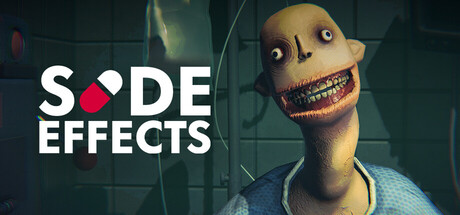
SIDE EFFECTS scores 77/100 — better than 79% of Strategy capsules (n=5,103).

Very Positive (25 reviews) · $3.74 · Released Nov 21, 2025 · By hirohun

Quick text summary

SIDE EFFECTS scored 77/100 on Steam Analyzer — Good for a Strategy capsule. Top priority fix: [genre_clarity] Add subtle visual cues (e.g., a pill bottle, multiple pills, or game board element) in the background or character's hand to reinforce the player-choice and pill-selection mechanics more explicitly.

Capsule scores by dimension

  • Genre Clarity: 7/10 — Twisted puzzle indie vibe clear. The grotesque character with exaggerated facial features and the pill icon in the logo immediately signal dark humor and experimental mechanics, positioning this as an indie puzzle-strategy game with psychological horror undertones. At TINY size, the character's unsettling design remains the dominant visual cue, though the specific mechanic (pill roulette) is less obvious without the logo context. The visual firmly communicates 'indie dark game' even at minimal sizes, which aligns well with the top performers like Buckshot Roulette and Lethal Company.
  • Title Readability: 8/10 — Strong logo placement and contrast. The 'SIDE EFFECTS' title uses clean sans-serif typography with excellent contrast against the dark background, and the integrated pill icon breaks up the wordmark memorably. At SMALL size (231x87), the title remains fully readable with clear letter separation; at TINY size (120x45), the text compresses slightly but the logo silhouette with the pill motif holds strong recognition. The placement in the upper left avoids the character entirely, preventing layering clutter and ensuring the title survives any Steam crop.
  • Contrast & Color: 8/10 — Excellent value separation and pop. The pale, sickly-yellow character face creates strong luminosity contrast against the dark teal-green background, while the bright white title text pops distinctly in the upper left corner. The grayscale test confirms the character's mid-tone face, dark eyes, and pink mouth form a clear silhouette; the white title holds maximum separation. At SMALL size, the character still reads as a cohesive focal point, and the warm-cool color relationship (yellow-orange skin vs. cool background) creates pleasant visual tension that draws the eye.
  • Uniqueness & Polish: 8/10 — Distinctive dark character design. The grotesque, unsettling character with a stitched mouth and oversized grin is visually memorable and immediately sets this apart from generic strategy game templates; it communicates a unique dark-comedy identity that aligns with the game's concept of experimental pills and survival. The art style shows polish—clean 3D rendering, intentional lighting that highlights the character's disturbing features, and a cohesive visual language that feels premium rather than asset-flipped. At TINY size, the character's distinctive silhouette remains recognizable, supporting long-term brand recall.
  • Brand Consistency: 7/10 — Cohesive dark indie identity. The capsule establishes a consistent visual language: grotesque character design, dark industrial setting, unsettling color palette (sickly yellow/orange, teal-green, dark shadows), and a clear typography system with the pill-integrated logo. The internal art direction feels unified—lighting, rendering quality, and aesthetic philosophy align across the character and environment. Without access to the 6 screenshots, internal cohesion appears strong enough to establish a memorable brand identity; the grotesque character and pill motif are iconic enough to stand alone on future marketing.
  • Composition: 8/10 — Clear hierarchy with strong focal point. The character occupies the right-center of the frame as the primary focal point, while the title anchors the upper left, creating a balanced diagonal flow that guides attention naturally. The background industrial setting provides depth and atmosphere without competing for focus; there is no clutter or equal-emphasis elements that scatter the eye. At SMALL and TINY sizes, the character remains the dominant read with the title providing secondary reinforcement, and the safe margins keep the character well clear of crop edges while the title sits in a protected corner.

What works

  • Memorable grotesque character. The unsettling face design with stitched mouth and exaggerated features is visually distinctive and immediately communicates the game's dark-comedy tone.
  • Title clarity and placement. Clean sans-serif typography with integrated pill icon sits in a protected upper-left region with excellent contrast, remaining readable at all sizes including TINY.
  • Strong value contrast. Pale character face against dark teal-green background creates luminous separation that reads clearly even in grayscale and at minimal sizes.
  • Cohesive dark identity. Consistent grotesque aesthetic, industrial lighting, and unsettling color palette establish a recognizable brand voice aligned with indie dark-strategy peers.

What hurts the capsule

  • Limited context for pill mechanic. While the logo integrates a pill, the core mechanic of 'pill roulette' is not immediately obvious from visuals alone; the character's presence may not clearly signal player choice or probability systems.
  • Genre ambiguity at first glance. The grotesque character design may be read as horror or dark comedy first, with the strategy/puzzle genre less obvious without gameplay context or UI cues.

Priority fixes

  1. [genre_clarity] Add subtle visual cues (e.g., a pill bottle, multiple pills, or game board element) in the background or character's hand to reinforce the player-choice and pill-selection mechanics more explicitly.
  2. [composition] Consider adding a small secondary element (UI frame, pill clusters, or game piece) in the lower right to create stronger visual equilibrium and hint at the multiplayer/strategic depth without cluttering the primary focal point.

Store copy priority fixes

  1. [feature_communication] Explain one concrete example of how an experimental item changes gameplay—e.g., 'Use a vaccine to neutralize poison pills' or 'Deploy a mouth clamp to skip a round'—to make strategy tangible.
  2. [feature_communication] Add a sentence describing typical match length and turn structure—e.g., 'Each match takes 10-15 minutes as you survive round after round of escalating pill choices.'—to set expectations.
  3. [uniqueness] Include a sentence on what makes this roulette variant strategically different—e.g., 'Unlike pure chance games, every pill choice is informed by your resistance level and available items,' to justify the strategy tag.
  4. [audience_targeting] Add a signal for casual vs. hardcore audiences—e.g., mention if games are quick and tense or require deeper strategic planning—so the right players self-select.

Related guides

  • Steam page optimisationCapsule, copy, screenshots, tags — the full Steam page conversion stack.
  • Steam tags guideTag selection, ordering, and how it shapes Steam's recommendation rails.

Steam app ID: 3799100 · Tags: Strategy, Gambling, Horror, Dark, 3D